
Last year, as part of our inaugural ‘Internet Archive Summer of Design fellowship,‘ we conducted design research on making our Books Page easier for patrons to navigate on both desktop and mobile devices. We are excited to announce that a significant number of these improvements have been implemented this past month.
We extend our heartfelt appreciation to Hayoon Choi, Jim Champ, Katherine McGonigle, Jayden Teoh, and all the dedicated individuals involved in bringing these changes to life.
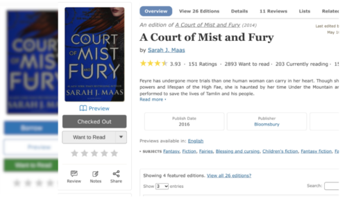
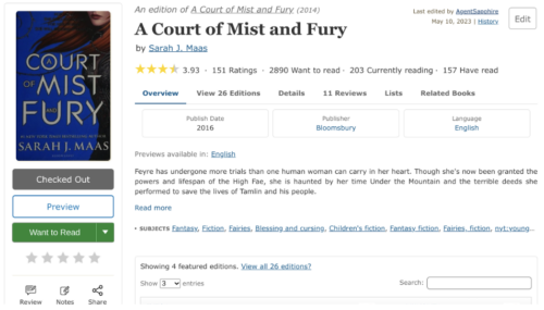
Key design updates we made to the our Books Page:
- Navigation Menu. The Books Page navigation menu has been designed to be more visually clear and relocated to the top of the page, directly beneath the main menu for better discovery. As you scroll, the fixed sub navigation menu dynamically highlights the corresponding section option based on the scroll position within the website.
- Buttons. Because we had so many buttons competing for attention, the “Preview” button has been replaced with a more subtle link below the book cover. The prominent green “Want to Read” button has also been updated to a more neutral gray color. Finally, on mobile, the share button has been moved up from below the fold, next to the title.
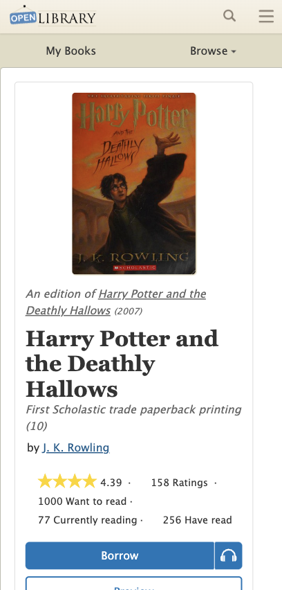
- Mobile. The Mobile Books Page now features the book title and author first, then a prominent book cover, and finally available read options, all above the fold.
Desktop
Before
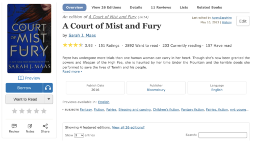
After
Mobile
Before
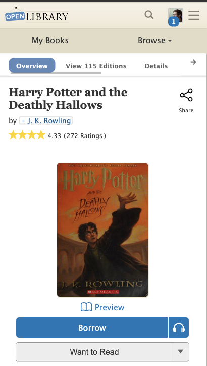
After
Feedback Welcome
In pursuit of improving accessibility for all patrons, we empathize that website changes may also be challenging for our readers. We welcome and appreciate your feedback so we can further improve the usability of our services. Please feel free to share your thoughts or questions in the comments section and connect with us on Twitter.