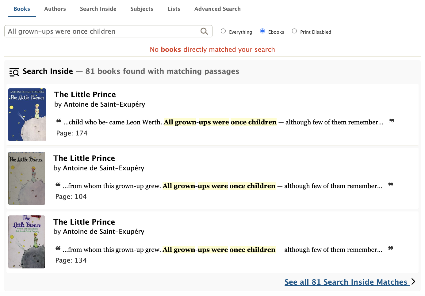
Thanks to the work of 2024 Design & Engineering Fellow Meredith White, the Open Library search page now suggests Search Inside results any time a search fails to find books matching by title or author.
Before:

After:


The planning and development of this feature were led by volunteer and 2024 Design & Engineering Fellow, Meredith White who did a fantastic job bringing the idea to fruition.
Meredith writes: Sooner or later, a patron will take a turn that deviates from what a system expects. When this happens, the system might show a patron a dead-end, something like: ‘0 results found’. A good UX though, will recognize the dead-end and present the patron with options to carry on their search. The search upgrade was built with this goal in mind: help patrons seamlessly course correct past disruptive dead-ends.
Many patrons have likely experienced a case where they’ve typed in a specific search term and been shown the dreaded, “0 results found” message. If the system doesn’t provide any next steps to the patron, like a “did you mean […]?” link, then this is a dead-end. When patrons are shown dead-ends, they have the full burden of figuring out what went wrong with their search and what to do next. Is the item the patron is searching for not in the system? Is the wrong search type selected (e.g. are they searching in titles rather than authors)? Is there a typo in their search query? Predicting a patron’s intent and how they veered off course can be challenging, as each case may require a different solution. In order to develop solutions that are grounded in user feedback, it’s important to talk with patrons
In the case of Open Library, interviewing learners and educators revealed many patrons were unaware that the platform has search inside capabilities.
“Several interviewees were unaware of Open Library’s [existing] full-text search, read aloud, or note-taking capabilities, yet expressed interest in these features.”
https://blog.openlibrary.org/2024/06/16/listening-to-learners-and-educators/
Several patrons were also unaware that there’s a way to switch search modes from the default “All” to e.g. “Authors” or “Subjects”. Furthermore, several patrons expected the search box to be type-agnostic.


From our conversations with patrons and reviewing analytics, we learned many dead-end searches were the result of patrons trying to type search inside queries into the default search, which primarily considers titles and authors. What does this experience look like for a patron? An Open Library patron might type into the default book search box, a book quote such as: “All grown-ups were once children… but only a few of them remember it“. Unbeknownst to them, the system only searches for matching book titles and authors and, as it finds no matches, the patron’s search returns an anticlimactic ‘No results found’ message. In red. A dead-end.
As a Comparative Literature major who spent a disproportionate amount of time of my undergrad flipping through book pages while muttering, “where oh where did I read that quote?”, I know I would’ve certainly benefitted from the Search Inside feature, had I known it existed. With a little brainstorming, we knew the default search experience could be improved to show more relevant results for dead-end queries. The idea that emerged is: display Search Inside results as a “did you mean?” type suggestion when a search returns 0 matches. This approach would help reduce dead-ends and increase discoverability of the Search Inside feature. Thus the “Search Inside Suggestion Card” was born.
The design process started out as a series of Figma drawings:
Discussions with the design team helped narrow in on a prototype that would provide the patron with enough links and information to send them on their way to the Search Inside results page, a book page or the text reader itself, with occurrences of the user’s search highlighted. At the same time, the card had to be compact and easy to digest at a glance, so design efforts were made to make the quote stand out first and foremost.
After several revisions, the prototype evolved into this design:
Early Results
The Search Inside Suggestion card went live on August 21st and thanks to link tracks that I rigged up to all the clickable elements of the card, we were able to observe its effectiveness. Some findings:
- In the first day, 2k people landed on the Search Inside Suggestion card when previously they would have seen nothing. That’s 2,000 dead-end evasion attempts!
- Of these 2,000 users, 60% clicked on the card to be led to Search Inside results.
- 40% clicked on one of the suggested books with a matching quote.
- ~8% clicked on the quote itself to be brought directly into the text.
I would’ve thought more people would click the quote itself but alas, there are only so many Comparative Literature majors in this world.
Follow-up and Next Steps
To complement the efforts of the Search Inside Suggestion card’s redirect to the Search Inside results page, I worked on re-designing the Search Inside results cards. My goal for the redesign was to make the card more compact and match its styling as closely as possible to the Search Inside Suggestion card to create a consistent UI.
Before:
After:
The next step for the Search Inside Suggestion card is to explore weaving it into the search results, regardless of result count. The card will offer an alternate search path in a list of potentially repetitive results. Say you searched ‘to be or not to be’ and there happens to be several books with a matching title. Rather than scrolling through these potentially irrelevant results, the search result card can intervene to anticipate that perhaps it’s a quote inside a text that you’re searching for. With the Search Inside Suggestion card taking the place of a dead-end, I’m proud to report that a search for “All grown-ups were once children…” will now lead Open Library patron’s to Antoine de Saint-Exupéry’s The Little Prince, page 174!
Technical Implementation
For the software engineers in the room who want a peek behind the curtain, working on the “Search Inside Suggestion Card” project was a great opportunity to learn how to asynchronously, lazy load “parts” of webpages, using an approach called partials. Because Search Inside results can take a while to generate, we decided to lazy load the Search Inside Suggestion Card, only after the regular search had completed.

If you’ve never heard of a partial, well I hadn’t either. Rather than waiting to fetch all the Search Inside matches to the user’s search before the user sees anything, a ‘No books directly matched your search’ message and a loading bar appear immediately. The loading bar indicates that Search Inside results are being checked, which is UX speak for this partial html template chunk is loading.
So how does a partial load? There’s a few key players:
- The template (html file) – this is the page that initially renders with the ‘No books directly matched your search’ message. It has a placeholder div for where the partial will be inserted.
- The partial (html file) – this is the Search Inside Suggestion Card
- The Javascript logic – this is the logic that says, “get that placeholder div from the template and attach it to an initialization function and call that function”
- More Javascript logic – this logic says, “ok, show that loading indicator while I make a call to the partials endpoint”
- A Python class – this is where the partials endpoint lives. When it’s called, it calls a model to send a fulltext search query to the database. This is where the user’s wrong turn is at last “corrected”. Their initial search in the Books tab that found no matching titles is now redirected to perform a Search Inside tab search to find matching quotes.
- The data returned from the Python class is sent back up the line and the data-infused partial is inserted in the template from step 1. Ta-da!
About the Open Library Fellowship Program
The Internet Archive’s Open Library Fellowship is a flexible, self-designed independent study which pairs volunteers with mentors to lead development of a high impact feature for OpenLibrary.org. Most fellowship programs last one to two months and are flexible, according to the preferences of contributors and availability of mentors. We typically choose fellows based on their exemplary and active participation, conduct, and performance within the Open Library community. The Open Library staff typically only accepts 1 or 2 fellows at a time to ensure participants receive plenty of support and mentor time. Occasionally, funding for fellowships is made possible through Google Summer of Code or Internet Archive Summer of Code & Design. If you’re interested in contributing as an Open Library Fellow and receiving mentorship, you can apply using this form or email openlibrary@archive.org for more information.
