Forward by Mek
For several years and with much gratitude, the Internet Archive has participated in Google’s Summer of Code (GSoC). GSoC is a program run by Google that supports select open source projects, like the Open Library, by generously funding students to intern with them for a summer. Participation in GSoC is as selective of organizations as it is for students and so in years when GSoC is not available to the Internet Archive, we try to fund our own Internet Archive Summer of Code (IASoC) paid fellowship opportunity.
GSoC and IASoC are traditionally limited to software engineering candidates which has meant that engineering contributions on Open Library have often outpaced its design. This year, to help us take steps towards righting this balance, an exceedingly generous donor (who wishes to remain anonymous but who is no less greatly appreciated) funded our first ever Internet Archive Summer of Design fellowship which was awarded to Hayoon Choi, a senior design student at CMU. In this post, we’re so excited to introduce you to Hayoon, showcase the impact she’s made with the Open Library team through her design work this summer, and show how her contributions are helping lay the groundwork to enable future designers to make impact on the Open Library project!
Introducing Hayoon Choi
Hello, my name is Hayoon Choi and this summer I worked as a UX designer with Open Library as part of the Internet Archive Summer of Code & Design fellowship program. I am a senior attending Carnegie Mellon University, majoring in Communication Design and minoring in HCI. I’m interested in learning more about creative storytelling and finding ways to incorporate motion design and interactions into digital designs.
Problem
When I first joined the Open Library team, the team was facing three design challenges:
- There was no precedent or environment for rapidly prototyping designs
- There wasn’t a living design system, just an outdated & static design pattern library
- The website didn’t display well on mobile devices, which represents and important contingency of patrons.
Approach
In order to solve these challenges, I was asked to lead two important tasks:
- Create a digital mockup of the existing book page (deskop and mobile) to enable rapid prototyping
- A propose a redesign of the book page optimized for mobile.
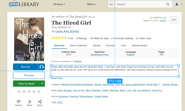
To achieve the first task, I studied the current design of the Open Library Book Page and prototyped the current layout for both mobile and desktop using Figma. In the process, I made sure every element of that Figma file is easily editable so that in the future, designers and developers can explore with the design without having to code.
For the second task, we first scoped our work by setting our focus to be the set of content which appears above the fold — that is, the content which first loads and appears within the limited viewport of a mobile device. We wanted to make sure that when the page initially loads, our patrons are satisfied with the experience they receive.
Even before conducting interviews with patrons, there were easily identifiable design issues with the current mobile presentation:
- Information hierarchy: some texts were too big; certain information took up too much space; placement of the book information were hard to discover
- Not mobile friendly: Some images were shown too small on images; it was hard to scroll through the related books; one feature included hovering, which is not available on mobile devices
To address these concerns, I worked with the Open Library community to receive feedback and designed dozens of iterations of the mobile book page using Figma. Based on feedback I learned about the most necessary information to be presented above-the-fold, I choose to experiment with 6 elements:
- The primary Call To Action (CTA) buttons: how do I make them more highlighted?
- The Navigation Bar: which placement and styling are most convenient and effective?
- The Editions Table: how might we make it easier for patrons to discover which other book editions and languages may be available?
- Ratings & reviews: how do I encourage users to rate more and help them understand the book effectively with the review system?
- Sharing: how do I make it easier for users to share the book?
- The Information Hierarchy: how can we reorder content to better meet the diverse needs of our audience?
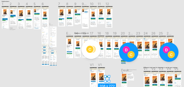
From these questions and feedback from the Open Library team, I was able to settle on five designs which seemed like effective possibilities for showcasing differences in book cover size, sharing buttons, information display, and rating and reviewing system which we wanted to test:
User Interviews & Mazes
With these five designs selected, I planned on running multivariate user testings to get feedback from actual users and to understand how I can more effectively make improvements to the design.
I believed that I would gather more participants if the user testing was done remotely since it would put less pressure on them. However, I wasn’t sure how I would do this until I discovered a tool called Maze.
Maze provides a way for patrons to interact with Figma mockups, complete certain tasks, answer questions, and leave feedback. While this is happening, Maze can record video sessions, keep track of where patrons are clicking, and provide valuable data about success rates on different tasks. I felt this service could be extremely useful and fitting for this project; therefore I went ahead and introduced Maze to the Open Library’s team. Thanks to a generous 3-month free partner coupon offered by Maze, I was able to create six Maze projects — one for each of our five new designs, as well as our current design as a control for our experiment. Each of these six links were connected to a banner that appeared across the Open Library website for a week. Each time the website was reloaded, the banner randomized the presented link so participants would be evenly distributed among the six Maze projects.
Although the Maze projects showed patrons different mobile screens, they enabled comparisons of functionality by asking patrons to answer the same pool of 7 questions and tasks:
- What was the color of the borrow button (after showing them the screen for five seconds)
- What key information is missing from this screen (while showing the above-the-fold screen)
- Share and rate this book
- Borrow the Spanish edition for this book
- Try to open a Spanish edition
- Review this book
- Try to open the preview of this book
In between these tasks, the participants were asked to rate how challenging these tasks were and to write their feelings or opinions.
In addition to Maze, which we hoped would help us scale our survey to reach a high volume of diverse participants, we also conducted two digital person-to-person user interviews over Zoom to get more in depth understanding about how patrons approach challenging tasks. Because Maze can only encode flows we program directly, these “in person” interviews gave us the ability to intervene and learn more when patrons became confused.
Results & Findings
After around a week of releasing the Maze links on the website, we were able to get a total of 760 participants providing feedback on our existing and proposed designs. Maze provided us with useful synthesis about how long it took participants to complete tasks and showed a heat map of where patrons were clicking (correctly or incorrectly) on their screens. These features were helpful when evaluating which designs would better serve our patrons. Here’s a list of findings I gathered from Maze:
The Sharing Feature:
Results suggest that the V1 design was most clear to patrons for the task of sharing the book. It was surprising to learn patrons, on average, spent the most time completing the task on this same design. Some patrons provided feedback which challenged our initial expectations about what they wanted to accomplish, reporting that they were opposed to sharing a book or that their preferred social network was not included in the list of options.
Giving a book a Star Rating:
One common reaction for all designs was that people expected that clicking on the book’s star ratings summary would take them to a screen where they could rate the book. It was surprising and revealing to learn that many patrons didn’t know how to rate books on our current book page design!
Leaving a Community Review
When participants were asked to leave a community review, some scrolled all the way down the screen instead of using the review navigation link which was placed above the fold. In design V4, using a Tag 🏷️ icon for a review button confused many people who didn’t understand the relationship between book reviews and topic tags. In addition, the designs which tested combining community review tags and star ratings under a single “review” button were not effective at supporting patrons in the tasks of rating or reviewing books.
Borrowing Other Editions
Many of our new designs featured a new Read button with a not-yet-implemented drop down button. While it was not our intention, we found many people clicked the unimplemented borrow drop down with the expectation that this would let them switch between other available book editions, such as those in different languages. This task also taught us that a book page navigation bar at the top of the design was most effective at supporting patrons through this task. However, after successfully clicking the correct navigation button, patrons had a difficult time using the provided experience to find an borrow a Spanish edition within the editions table. Some patrons expected more obvious visual cues or a filtering system to more easily distinguish between available editions in different languages.
Synthesis
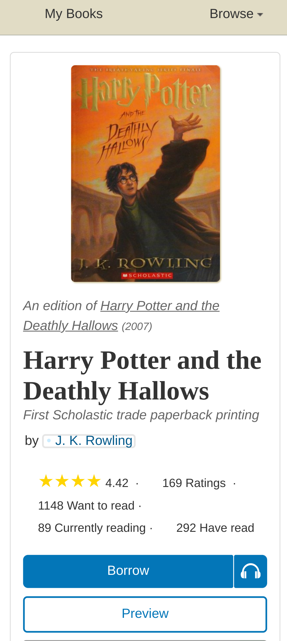
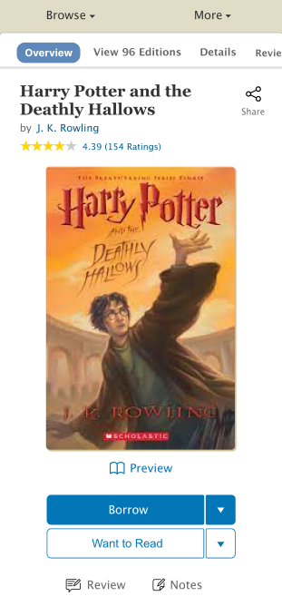
By synthesizing feedback across internal stakeholders, user interviews, and results from our six mazes, we arrived at a design proposal which provides patrons with several advantages over today’s existing design:
- First and foremost, redesigned navigation at the very top of the book page
- A prominent title & author section which showcases the book’s star ratings and invites the patron to share the book.
- A large, clear book cover to orient patrons.
- An actionable section which features a primary call to action of “Borrow”, a “Preview” link, and a visually de-emphasized “Want to Read” button. Tertiary options are provided for reviewing the book and jotting notes.
- Below the fold, proposals for a re-designed experience for leaving reviews and browsing other editions.
Reflections
I had a great time working with Open Library and learning more about the UX field. I enjoyed the process of identifying problems, iterating, and familiarizing myself with new tools. Throughout my fellowship, I got great feedback and support from everyone from the team, especially my mentor Mek. He helped me plan an efficient schedule while creating a comfortable working environment. Overall, I truly enjoyed my working experience here and I hope my design works will get to help patrons in the future!
About the Open Library Fellowship Program
The Internet Archive’s Open Library Fellowship is a flexible, self-designed independent study which pairs volunteers with mentors to lead development of a high impact feature for OpenLibrary.org. Most fellowship programs last one to two months and are flexible, according to the preferences of contributors and availability of mentors. We typically choose fellows based on their exemplary and active participation, conduct, and performance within the Open Library community. The Open Library staff typically only accepts 1 or 2 fellows at a time to ensure participants receive plenty of support and mentor time. Occasionally, funding for fellowships is made possible through Google Summer of Code or Internet Archive Summer of Code & Design. If you’re interested in contributing as an Open Library Fellow and receiving mentorship, you can apply using this form or email openlibrary@archive.org for more information.
