Category Archives: Mobile

A Brand New My Books Experience

Have you noticed our new My Books page experience?
Please let us know what you think!

Read on to learn more about what’s changed.

Forward by Mek

This year we’ve had the great fortune of collaborating with Samuel Grunebaum, 2022 Open Library Design & Engineering Fellow. Samuel is wonderfully positioned at the cross-section of software engineering, design, and education, making him capable of rapidly prototyping new designs, ensuring these designs are clear and instructional, and bringing these designs to life through engineering. It’s rare I find someone, like Sam, who can so easily and effectively switch contexts between design and engineering while also keeping bigger product pictures in mind. This set of skills has not only made Sam essential to early prototyping stages, we have also benefited greatly from Sam’s ability to uniquely recognize and raise challenges about component accessibility and mobile/desktop compatibility we likely would have otherwise missed. In addition to being a 2022 Open Library Fellow, Sam co-directs a software & design consultancy that is accepting new freelance projects, tutors college, high school, and intro-level computer science and is accepting new students, and is open to the right mission-aligned, full-time role.

Personal Intro

Hello, I’m Samuel Grunebaum and I’ve been working with Open Library as a Design & Engineering Fellow, contributing designs and code to the My Books redesign process. I’m currently transitioning into a career in software design and front end engineering after working as a Computer Science educator at the Horace Mann School in The Bronx, New York and as a freelance designer, developer, and teacher in all things software.

Problem

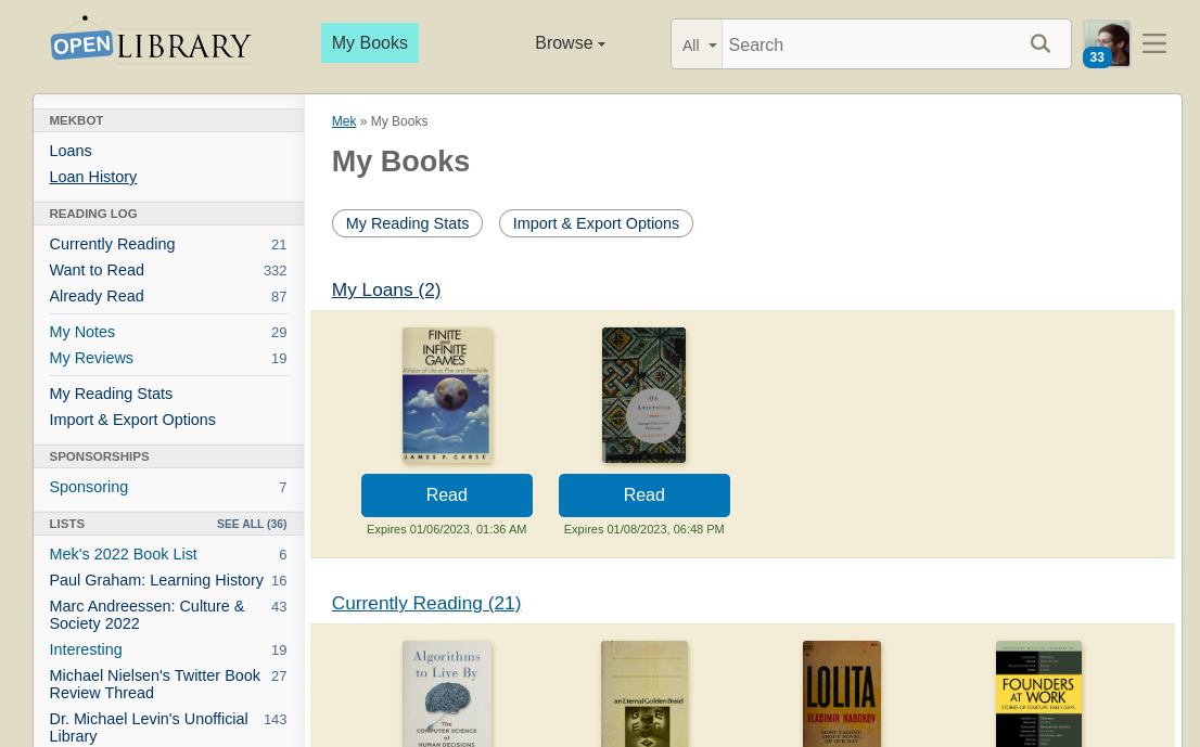
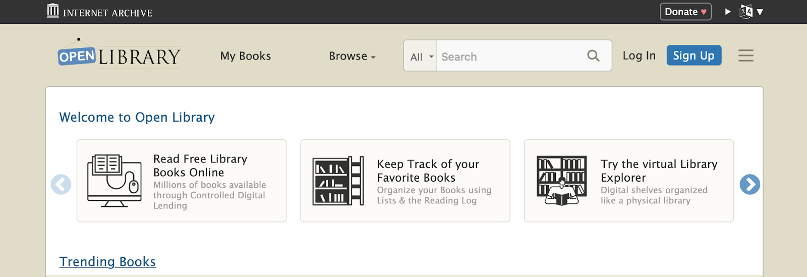
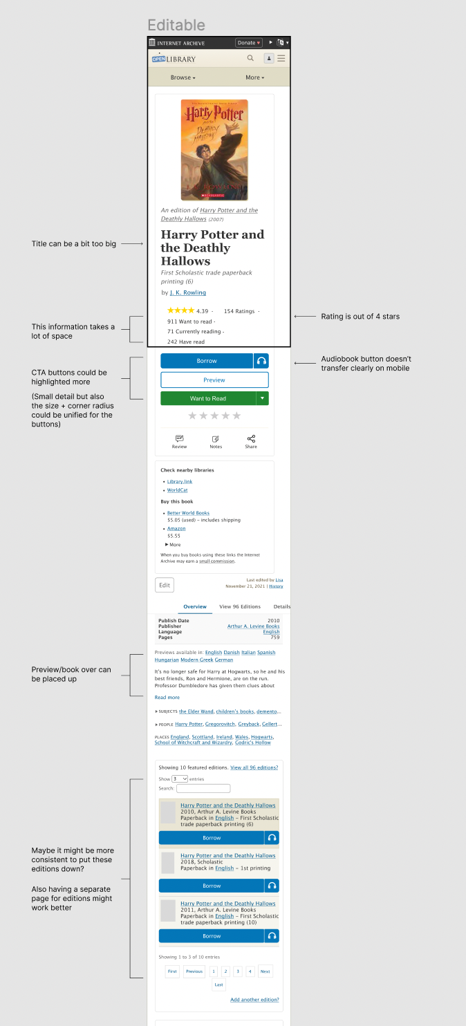
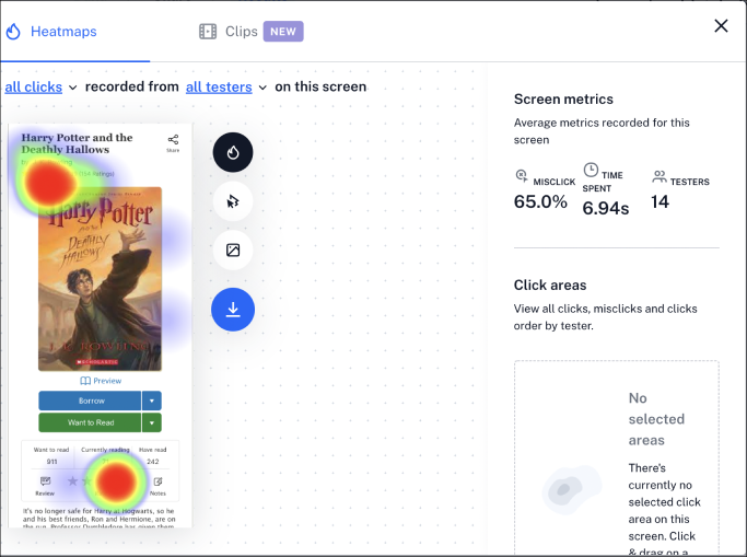
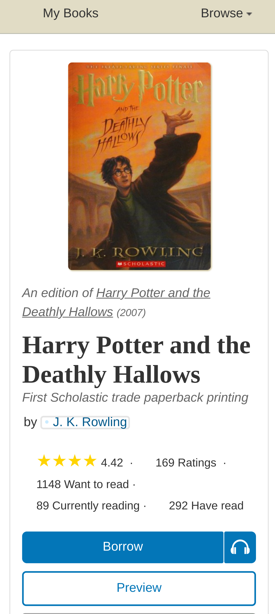
Open Library patrons and stakeholders alike identified the My Books page as a major pain point in the site’s navigation and information hierarchy. At the beginning of the project the desktop interface loaded by clicking the ‘My Books’ button in the header looked like this:

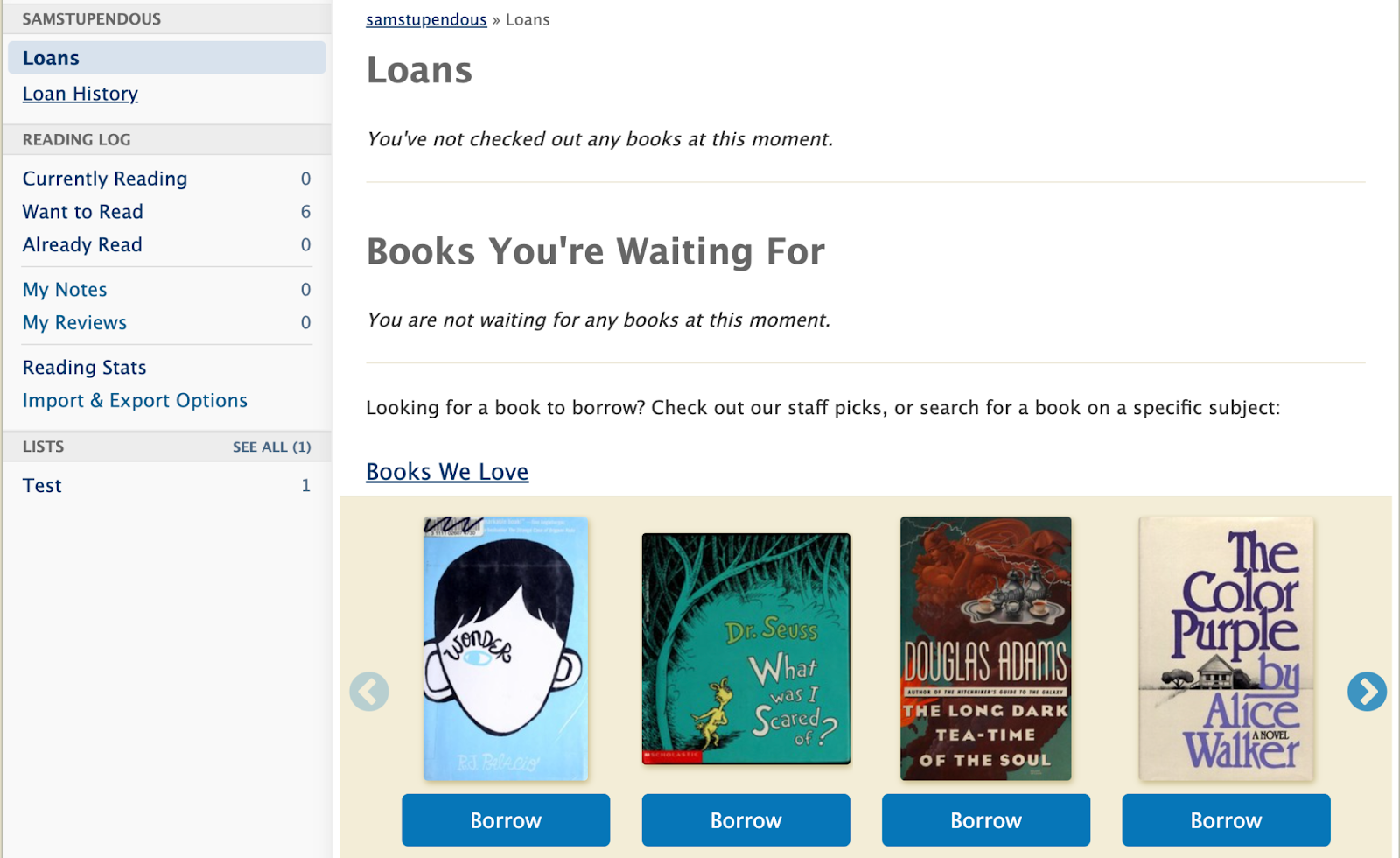
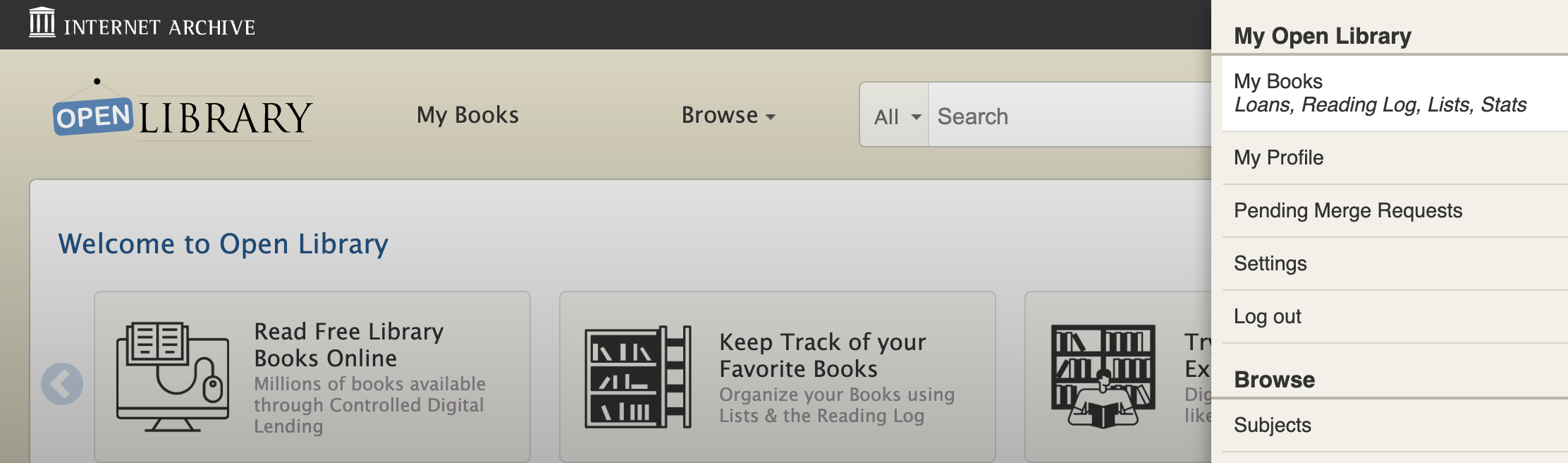
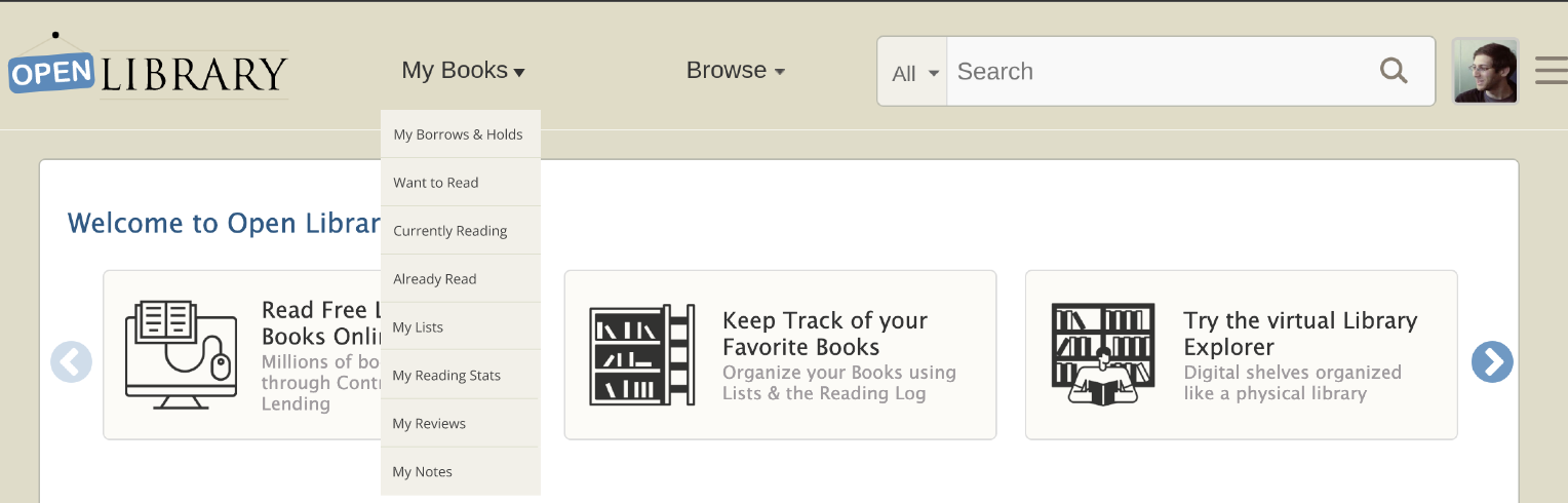
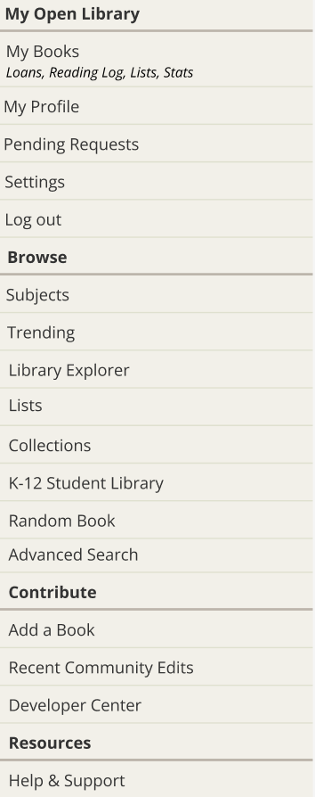
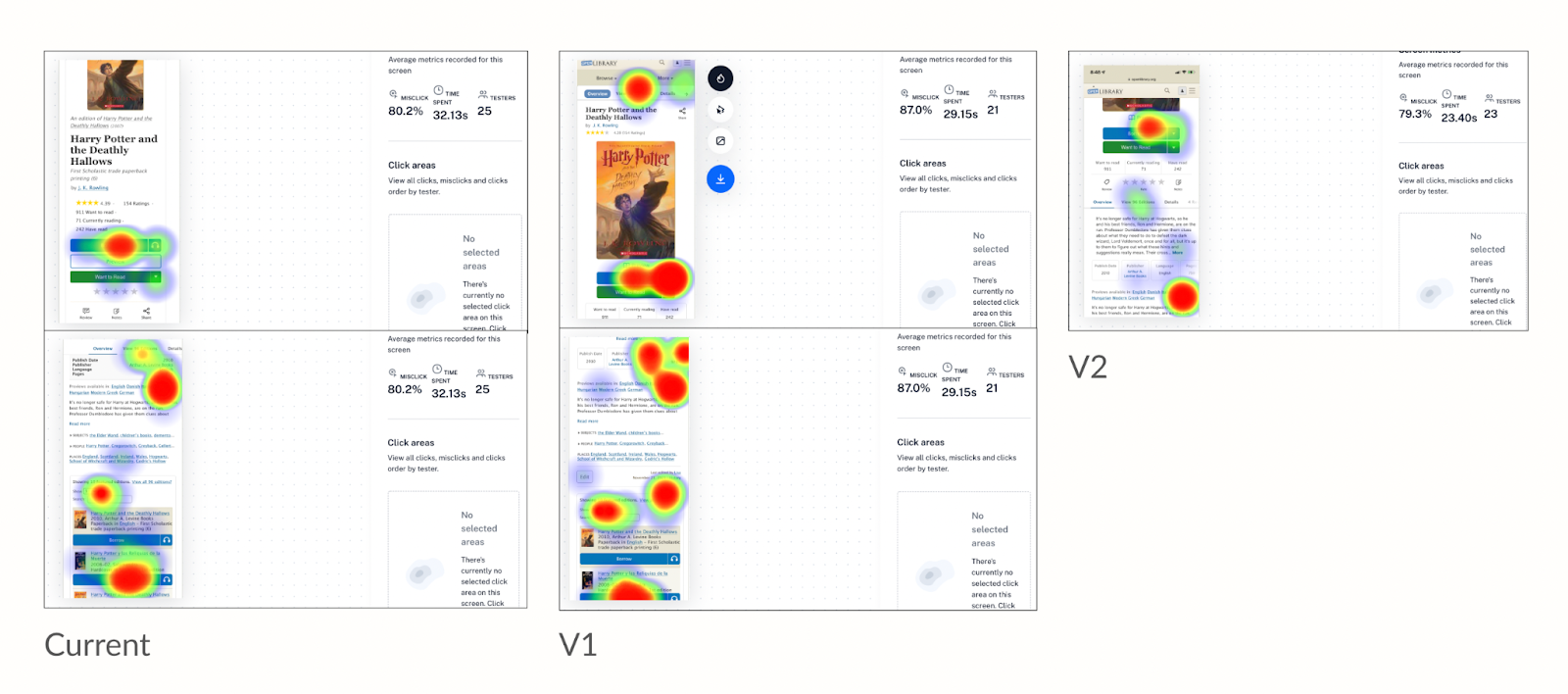
Perhaps the most confusing issue with this flow, is that the ‘My Books’ button brought patrons to their account’s Loans page. Another problem that was continually observed with the existing design is the mobile navigation on this page:

The mobile design took the desktop sidebar menu and added it directly below the site header, creating three layers of navigation and a very confusing split in the My Books page interface. 

The central problem of the existing design for My Books was that there was no true My Books page, but rather a My Books button driving to the Loans page. This meant that there was no single place for patrons to find their books, whether books they had on loan or books they had added to one of their reading logs. 

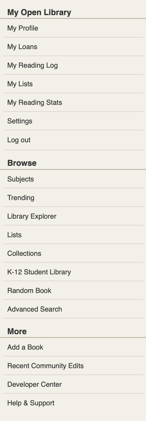
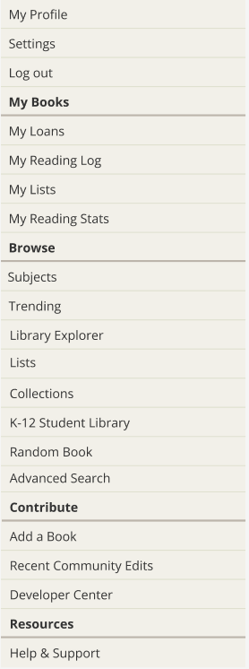
The previous menu design also had the unfortunate side effect of burying the Reading Log options, as well as Reading Stats, Notes, Reviews, and Import/Export options deep below the fold in an already confusing mobile menu. 

Digging deeper into this problem and hearing from Open Library stakeholders, patrons, librarians, and the community at large clarified the direction we would take: working towards a mobile-first consolidated My Books interface that gives patrons an understandable and discoverable way to access the books associated with their account, as well as the other account specific sections including Stats, Notes/Reviews, and Lists.

Interim Fix

Before beginning the design process in earnest, we decided an interim fix would be helpful to mitigate the confusing nature of the mobile My Books navigation. The solution we decided on was an extremely quick fix, able to be implemented in just a few minutes. 

The adjustments made used a darker color to differentiate the menu from the rest of the header and the page content, as well as making the menu section smaller with an adjustable height click-and-drag feature:

Approach

After meeting with members of the Open Library team to discuss the main issues, we agreed that the central areas to focus on were:

  1. Creating an interface unique to My Books that would consolidate a patron’s loans and logs into one page accessed by the My Books button
  2. Improving the usability of the My Books page on mobile by moving towards a responsive, mobile-first design for the My Books page and redesigning the menu on mobile

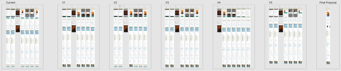
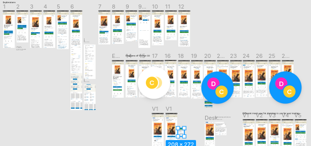
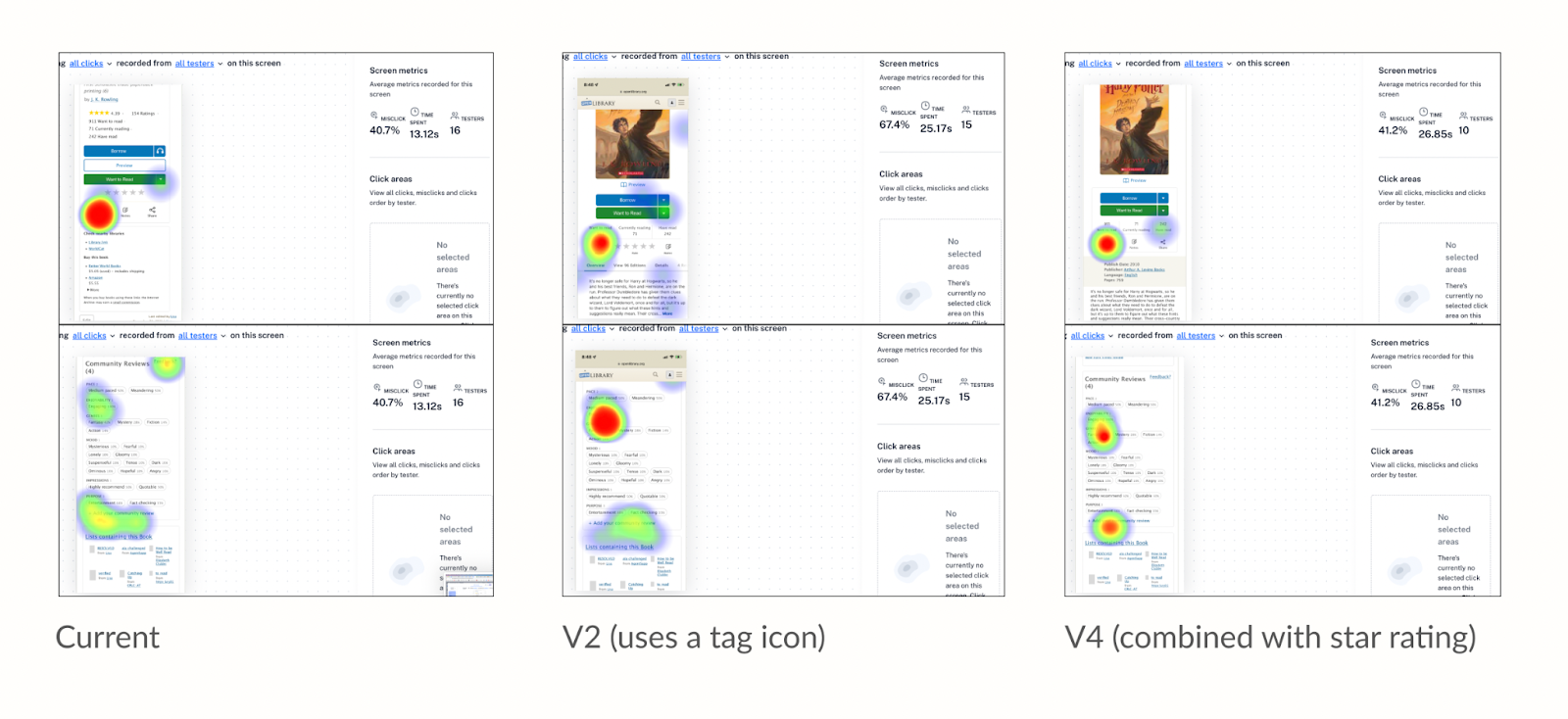
The next step was to iterate multiple potential interfaces for the new My Books page on both mobile and desktop. With the help of the Open Library team and other design fellows, we came up with the following options for mobile and desktop My Books interfaces:

In conjunction with Dana, another 2022 Design Fellow, we continued to iterate on the designs based on feedback received from Open Library stakeholders, librarians, and patrons. 

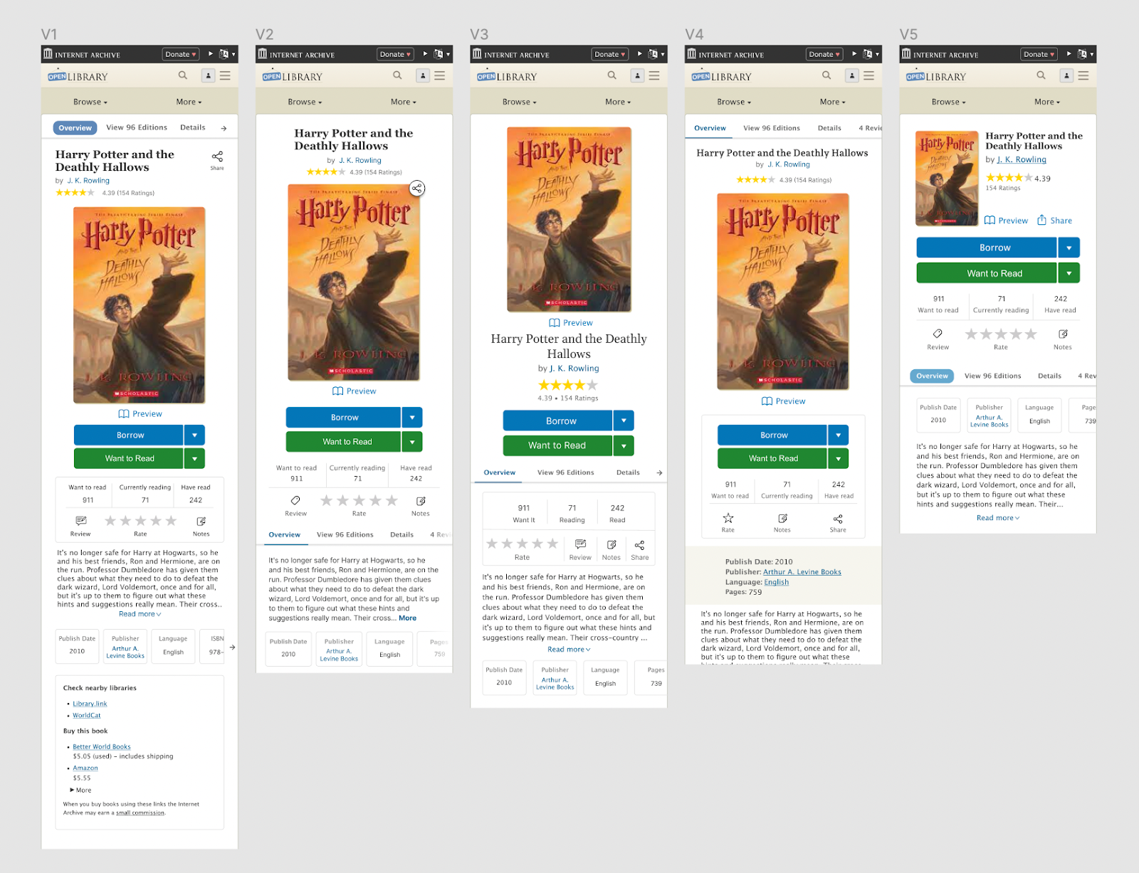
We settled on the following approach for desktop, which includes new carousel sections for displaying books and creates space for a Reading Stats data visualization widget:

Alongside the new desktop design, the mobile-first redesign that we settled on makes use of the existing sidebar menu to guide the structure of the new mobile interface while making use of an information hierarchy already familiar to patrons. 

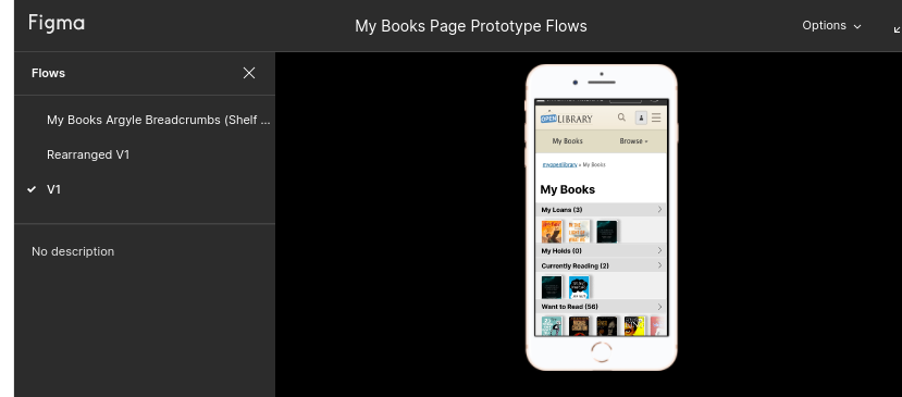
This mobile design not only improves usability and accessibility to the key components of My Books, but also decreases engineering overhead by allowing for a responsive design using the original sidebar menu:

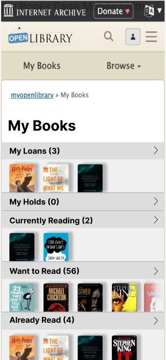
You can try the new mobile design prototype here.

First Phase Release: Desktop My Books Interface

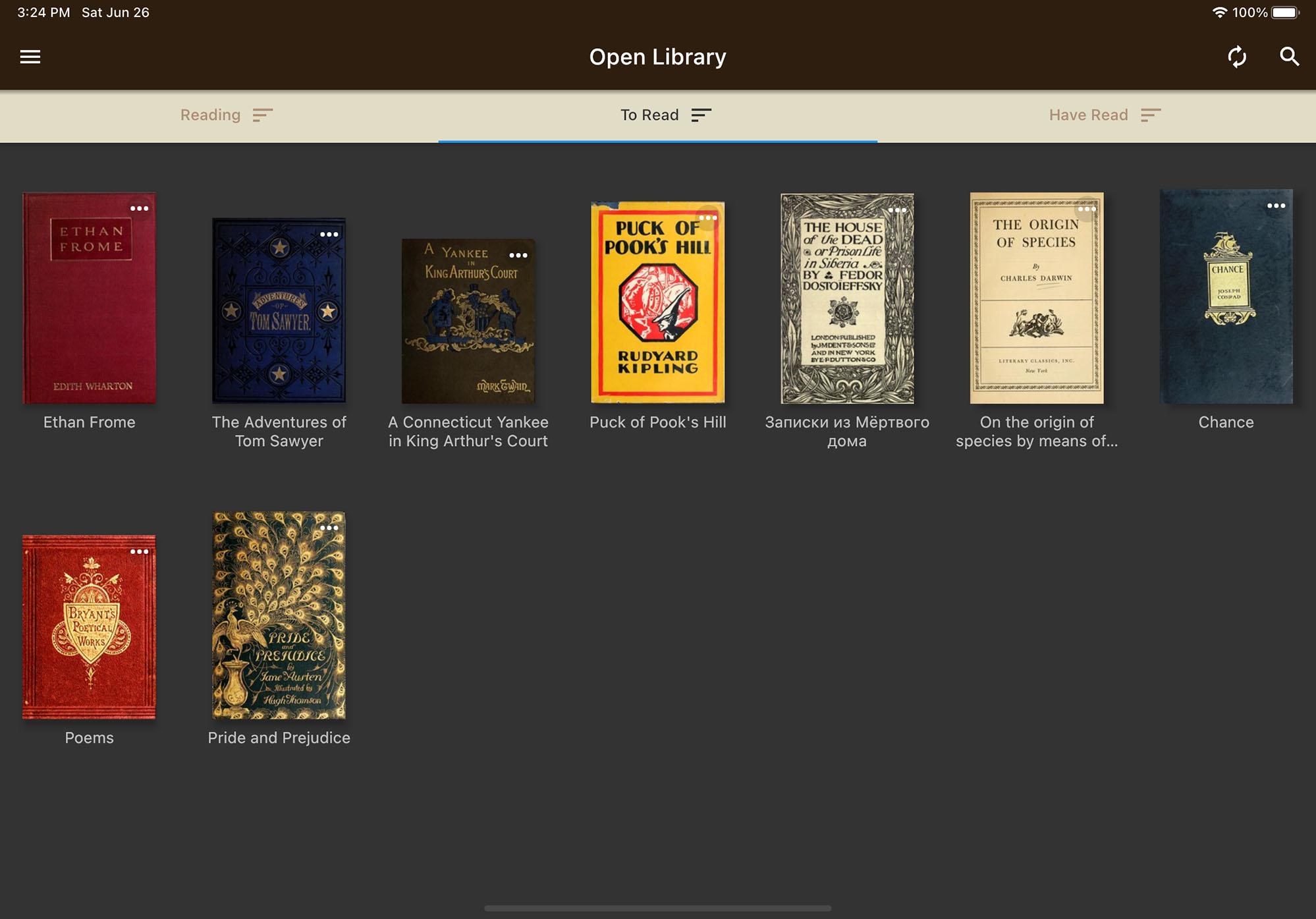
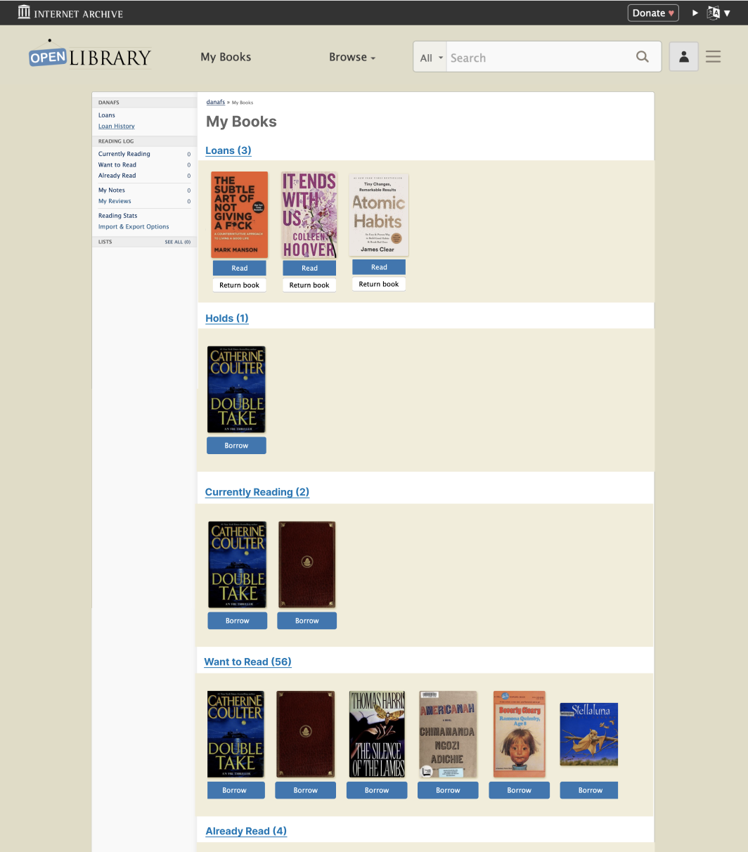
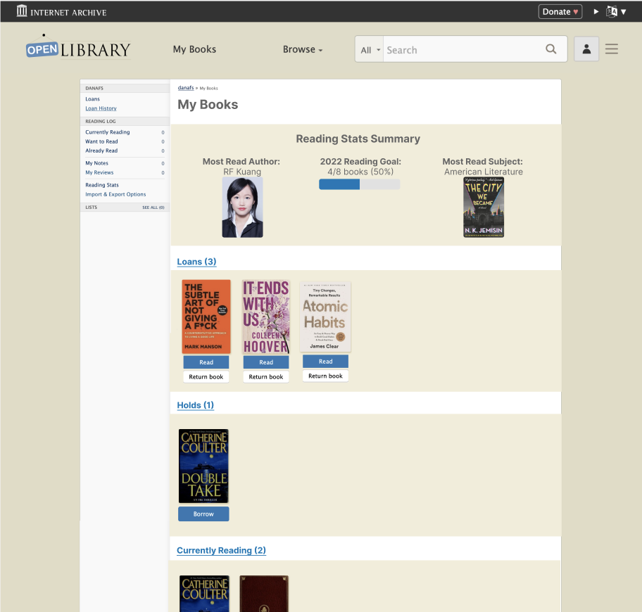
The first and most immediate step to improving the overall My Books experience was to create a distinct page on the site for an account’s books. The new My Books page now exists at /account/books for any patron of Open Library. The new page is almost a carbon copy of the original My Books page, but with its own content that is separate from the Loans page, which was originally what came up when clicking My Books in the header. Below is an image of the current desktop release of My Books:

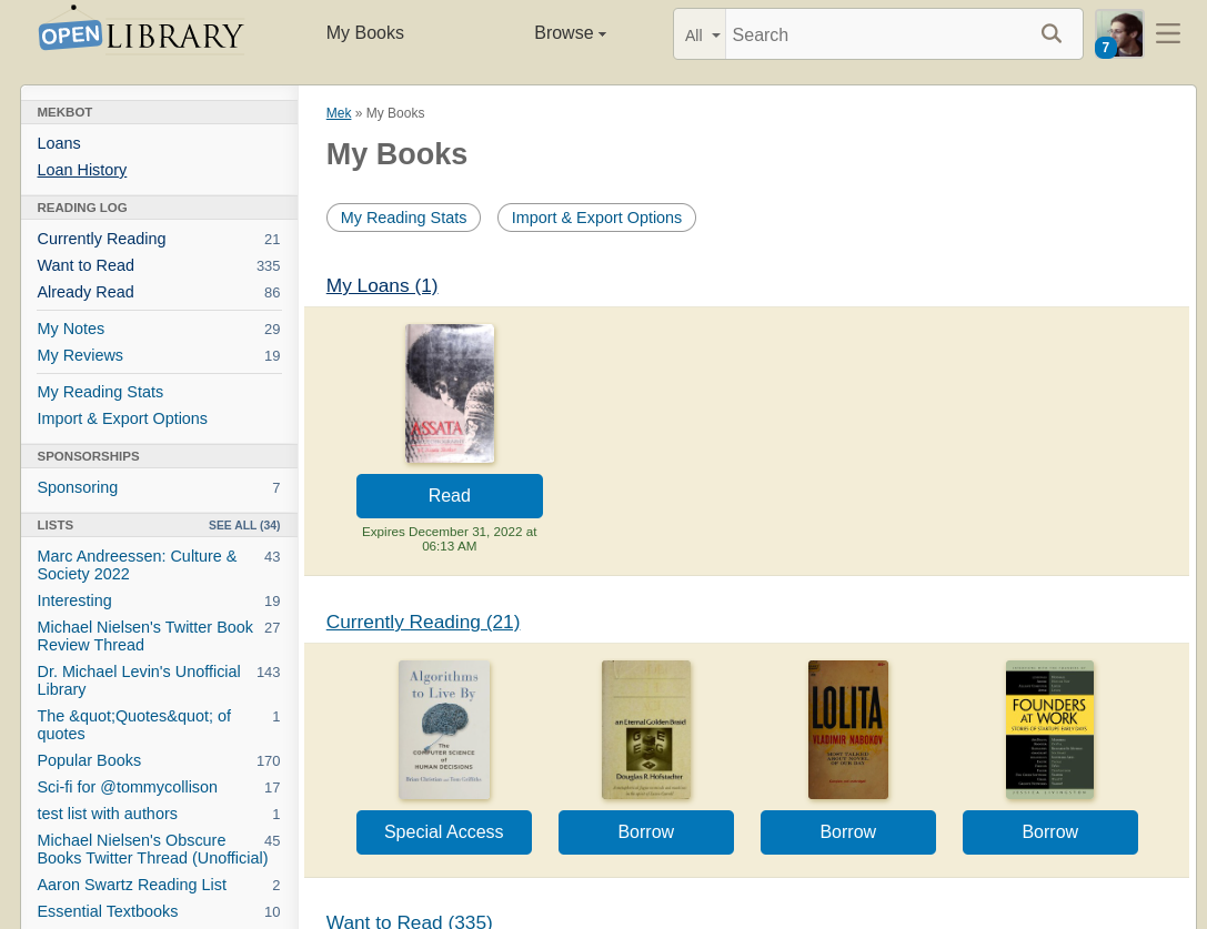
After adding the new page at /account/books, I created a new file for the My Books content and added custom carousels to the page for displaying a patron’s loans and reading logs. Beyond improving the flow of clicking the My Books button, this initial redesign aims to increase user engagement with reading logs and will also populate the My Books page with images of book covers from a patron’s own selections, creating a more welcoming and dynamic account page driving from the My Books header button.

Another change in this release is the addition of Reading Stats and Import/Export Options buttons at the top of the page, as these are currently buried at the bottom of the My Books sidebar. In the next phase of the design, there will be a prominent link to Stats at the top of the My Books page with the addition of the data visualization widget.

The creation of this page not only provides an elegant interim solution to the issue of confusing My Books navigation by adding a novel page to the Open Library but also lays the groundwork for a more comprehensive redesign including mobile-first improvements, multiple new custom components, and more prominently featured a patron’s Reading Stats. 

Next Steps: Mobile Release and Stats

The next steps of the My Books redesign process will begin with improving the mobile usability by overhauling the My Books interface. The engineering approach I will take is to hide the My Books index content on mobile, instead only displaying the sidebar menu as the whole My Books interface. The sidebar will be responsively designed to display custom carousels on mobile, as rendered in this interactive Figma prototype.

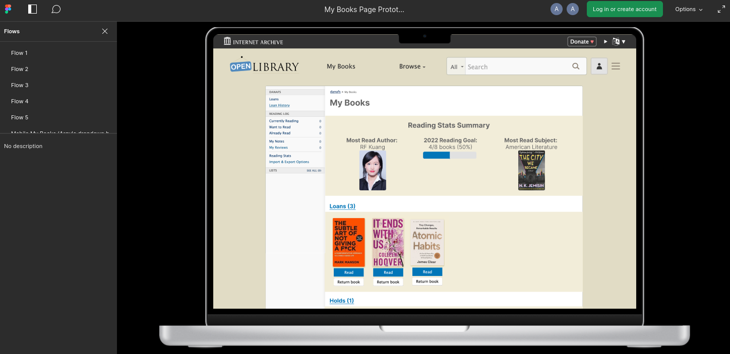
The next and final step after completing the implementation of the mobile redesign will be to finish the redesigned desktop My Books interface by building the Reading Stats data visualization widget. Here’s an interactive Figma prototype of this new design.

I am so excited to continue working on this redesign process, which has already been a wonderful introduction to the Open Library design system and code base. Moreover, I’m excited to contribute to what is hopefully a welcome improvement to the Open Library ecosystem, increasing both access and usability to some really wonderful account features. My hope is that patrons will be able to more easily save and read books on Open Library once they have one clearly defined place to look at all of their books, whether checked out or saved in reading logs, as well as their reading stats and account information.

Reflections

Working on this project with the Open Library community has been an amazing experience in UX design, full stack web development, and community collaboration across state and national lines. I am grateful to be able to contribute to a project that is so meaningful to so many people through its unique ability to disseminate knowledge freely to anyone with Internet access. It was also a fun way to expand my web design and development experience. 

I am immensely grateful to the Open Library community as a whole for being so welcoming to me when I joined a few months ago and for continuously supporting my design process through helpful critiques and design input, as well as the general kindness shown in the weekly community meetings. I am especially grateful to Mek, my counter-point on Open Library staff, who has taught me so much about the Internet Archive stack and the Open Library design language, and my main collaborator Dana, who has expertly taken the reins on the Desktop interface designs and navigation for the overall site. I also want to extend my thanks to Drini, Lisa, Jim, Abby, and Hayoon who have all had invaluable contributions to the My Books design and implementation process, as well as the ongoing development of a comprehensive Open Library design system. I’m so excited to continue working with this community and for the completion of the My Books redesign. 

Improvements to the Main Navigation

Dana, UX/Design Fellow on Open Library

Forward by Mek

Few aspects of a website have greater impact and receive less recognition than good navigation. If done well, a site’s main navigation is almost invisible: it’s there when patrons need it, out of the way when they don’t, and it zips patrons to the right place without making them overthink. Over the years, we’ve attempted improvements to our navigation but we haven’t had the design bandwidth to conduct user research and verify that our changes solved our patrons problem. It turns out, we still had several opportunities for improvement. That’s why this year we were incredible lucky to have collaborated with Open Library UX Design Fellow Dana Fein-Schaffer, who recently transitioned into design from a previous role as a neuropsychological researcher. Dana’s formal education and experience links a trifecta of complimentary fields — computer science, psychology, and design — and has resulted in unique perspective as we’ve endeavored to redesign several of Open Library’s core experiences: the website’s main navigation and the desktop version of our My Books page.

As an Open Library UX Design Fellow, Dana has been in charge of design direction, conducting user interviews, figma mockups, feedback sessions, and communicating decisions to stakeholders. In addition to her skill prototyping and notable problem solving capabilities, Dana’s warmth with the community, affinity for collaboration, and enthusiasm for the project has made teaming up with her a gift. While we’d rather the fellowship not end, we endorse her work with great enthusiasm and highly recommend organizations which share our values to view Dana’s portfolio and engage her for future design opportunities.

The Design Process

IMG_7214.JPG

Hello, I’m Dana Fein-Schaffer, and I’ve been working as a UX Design Fellow with Open Library over the past several months. I’m currently transitioning into UX Design because after gaining professional experience in both psychology research and software engineering, I’ve realized that UX is the perfect blend of my skills and interests. I’ve been enjoying growing my UX skillset, and working with Open Library has been a perfect opportunity for me to gain some formal experience because I love reading and was hoping to work on a book-related project. Moving forward, I’m particularly excited about working as a UX designer for an organization that focuses on social good, especially in the literary, education, or healthcare spaces! If you have a role that may be a good fit, or if you work in one of those industries and are interested in connecting, please feel free to reach out. You can also learn about me from my portfolio.

Problem

At the beginning of my project, the current navigation bar and hamburger menu looked like this: 

I met with members of the Open Library team to identify three key areas of concern: 

  1. The label “more” was not descriptive, and it was unclear to patrons what this meant
  2. The hamburger menu was not consistent with the navigation bar items
  3. The hamburger menu was confusing for patrons, especially new patrons, to navigate

Approach

Before I began my project, the Open Library team decided to implement an interim solution to the first point above. To address the concern with the “more” label, the navigation menu was changed to instead include “My Books” and “Browse.” The website analytics showed that patrons frequent their Loans page most, so for now, the “My Books” page brings patrons to the Loans page. 

To begin redesigning the main site navigation, I first created a prototype in Figma with some potential solutions that built off of this updated navigation menu:

  1. I created a dropdown menu for “My Books” that would allow patrons to select the specific page they would like to go to, rather than automatically going to the Loans page
  1. I reorganized the hamburger menu to be consistent with the navigation menu and to use the subheadings of “Contribute” and “Resources” instead of “More.” I felt that these changes would make the hamburger menu easier to navigate for both new and long-time patrons. 

After creating the prototype, my next goal was to get feedback from patrons, so I scheduled user interviews with volunteers.

User Interviews

I conducted user interviews via Zoom with four patrons to answer the following questions: 

  1. How do users feel about the My Books dropdown? 
  2. Are users using My Books and Browse from the navigation menu or hamburger menu?
  3. Are users able to effectively use the hamburger? Do they find it easier or harder to find what they’re looking for using the reorganized hamburger?

Results & Findings

  1. Three out of the four patrons preferred the dropdown, and the fourth user didn’t have a preference between the versions. The patrons enjoyed having the control to navigate to a specific section of My Books. 
  2. All users used the navigation menu at the top of the page to navigate, rather than the hamburger menu, which supported the switch to “My Books” instead of “More.” This finding also highlighted the need to make sure patrons could access the pages they wanted to access from the top navigation menu. 
  3. Finally, all four patrons found the existing hamburger menu confusing and preferred the reorganized hamburger. Some patrons specifically mentioned that the reorganized hamburger was more compact and that they felt that the headings “contribute” and “resources” were more clear than “more.”

Synthesis and a New Direction

After learning from the user interviews that patrons preferred increased granularity for accessing My Books and a more concise hamburger menu, the Open Library team began discussing the exact implementation. We wanted to keep the navigation and hamburger menus consistent; however, we also wanted to provide many options in the My Books dropdown, which made the hamburger menu less concise. 

At the same time that we were debating the pros and cons of various solutions, another Open Library UX Design fellow, Samuel G, was working on designing a My Books landing page for the mobile site. Inspired by his designs, I created mockups for a desktop version of the My Books page. Having a My Books page that summarizes patrons’ loans, holds, and reading log at a glance allows patrons to still have increased control over My Books navigation while keeping the hamburger menu concise, since all of the individual My Books items can now be condensed into one link. 

Furthermore, having a My Books landing page opens the door for more ways for patrons to interact with their reading through Open Library. For instance, I’ve created a mockup that includes a summary of a patron’s reading stats and yearly reading goal at the top of the page. 

As we work towards implementing this design, I’m looking forward to getting feedback from patrons and brainstorming even more ways to maximize the use of this page. 

Reflections

Working with the Open Library team has been an amazing experience. I’m so grateful that I got to lead a UX project from start to end, beginning with user research and ending with final designs that are ready to be implemented. Working with such a supportive team has allowed me to learn more about the iterative design process, get comfortable with sharing and critiquing my designs, and gain more experience with design tools, such as Figma. It was also a great learning experience that sometimes your projects will take an unexpected turn, but those turns help you eventually come to the best possible design solution. Thank you to everyone who provided feedback and helped me along the way, especially Mek, who was a wonderful mentor, and Sam, who was a great collaborator on our My Books mobile and desktop project!

About the Open Library Fellowship Program

The Internet Archive’s Open Library Fellowship is a flexible, self-designed independent study which pairs volunteers with mentors to lead development of a high impact feature for OpenLibrary.org. Most fellowship programs last one to two months and are flexible, according to the preferences of contributors and availability of mentors. We typically choose fellows based on their exemplary and active participation, conduct, and performance within the Open Library community. The Open Library staff typically only accepts 1 or 2 fellows at a time to ensure participants receive plenty of support and mentor time. Occasionally, funding for fellowships is made possible through Google Summer of Code or Internet Archive Summer of Code & Design. If you’re interested in contributing as an Open Library Fellow and receiving mentorship, you can apply using this form or email openlibrary@archive.org for more information.

Internet Archive Summer of Design 2022

Forward by Mek

For several years and with much gratitude, the Internet Archive has participated in Google’s Summer of Code (GSoC). GSoC is a program run by Google that supports select open source projects, like the Open Library, by generously funding students to intern with them for a summer. Participation in GSoC is as selective of organizations as it is for students and so in years when GSoC is not available to the Internet Archive, we try to fund our own Internet Archive Summer of Code (IASoC) paid fellowship opportunity.

GSoC and IASoC are traditionally limited to software engineering candidates which has meant that engineering contributions on Open Library have often outpaced its design. This year, to help us take steps towards righting this balance, an exceedingly generous donor (who wishes to remain anonymous but who is no less greatly appreciated) funded our first ever Internet Archive Summer of Design fellowship which was awarded to Hayoon Choi, a senior design student at CMU. In this post, we’re so excited to introduce you to Hayoon, showcase the impact she’s made with the Open Library team through her design work this summer, and show how her contributions are helping lay the groundwork to enable future designers to make impact on the Open Library project!

Introducing Hayoon Choi

Profile photo for hayoonc

Hello, my name is Hayoon Choi and this summer I worked as a UX designer with Open Library as part of the Internet Archive Summer of Code & Design fellowship program. I am a senior attending Carnegie Mellon University, majoring in Communication Design and minoring in HCI. I’m interested in learning more about creative storytelling and finding ways to incorporate motion design and interactions into digital designs. 

Problem

When I first joined the Open Library team, the team was facing three design challenges:

  1. There was no precedent or environment for rapidly prototyping designs
  2. There wasn’t a living design system, just an outdated & static design pattern library
  3. The website didn’t display well on mobile devices, which represents and important contingency of patrons.

Approach

In order to solve these challenges, I was asked to lead two important tasks:

  1. Create a digital mockup of the existing book page (deskop and mobile) to enable rapid prototyping
  2. A propose a redesign of the book page optimized for mobile.

To achieve the first task, I studied the current design of the Open Library Book Page and prototyped the current layout for both mobile and desktop using Figma. In the process, I made sure every element of that Figma file is easily editable so that in the future, designers and developers can explore with the design without having to code.

For the second task, we first scoped our work by setting our focus to be the set of content which appears above the fold — that is, the content which first loads and appears within the limited viewport of a mobile device. We wanted to make sure that when the page initially loads, our patrons are satisfied with the experience they receive.

Even before conducting interviews with patrons, there were easily identifiable design issues with the current mobile presentation:

  • Information hierarchy: some texts were too big; certain information took up too much space; placement of the book information were hard to discover
  • Not mobile friendly: Some images were shown too small on images; it was hard to scroll through the related books; one feature included hovering, which is not available on mobile devices

To address these concerns, I worked with the Open Library community to receive feedback and designed dozens of iterations of the mobile book page using Figma. Based on feedback I learned about the most necessary information to be presented above-the-fold, I choose to experiment with 6 elements:

  1. The primary Call To Action (CTA) buttons: how do I make them more highlighted?
  2. The Navigation Bar: which placement and styling are most convenient and effective?
  3. The Editions Table: how might we make it easier for patrons to discover which other book editions and languages may be available?
  4. Ratings & reviews: how do I encourage users to rate more and help them understand the book effectively with the review system?
  5. Sharing: how do I make it easier for users to share the book?
  6. The Information Hierarchy: how can we reorder content to better meet the diverse needs of our audience?

From these questions and feedback from the Open Library team, I was able to settle on five designs which seemed like effective possibilities for showcasing differences in book cover size, sharing buttons, information display, and rating and reviewing system which we wanted to test:

User Interviews & Mazes

With these five designs selected, I planned on running multivariate user testings to get feedback from actual users and to understand how I can more effectively make improvements to the design. 

I believed that I would gather more participants if the user testing was done remotely since it would put less pressure on them. However, I wasn’t sure how I would do this until I discovered a tool called Maze.

Maze provides a way for patrons to interact with Figma mockups, complete certain tasks, answer questions, and leave feedback. While this is happening, Maze can record video sessions, keep track of where patrons are clicking, and provide valuable data about success rates on different tasks. I felt this service could be extremely useful and fitting for this project; therefore I went ahead and introduced Maze to the Open Library’s team. Thanks to a generous 3-month free partner coupon offered by Maze, I was able to create six Maze projects — one for each of our five new designs, as well as our current design as a control for our experiment. Each of these six links were connected to a banner that appeared across the Open Library website for a week. Each time the website was reloaded, the banner randomized the presented link so participants would be evenly distributed among the six Maze projects.

Although the Maze projects showed patrons different mobile screens, they enabled comparisons of functionality by asking patrons to answer the same pool of 7 questions and tasks:

  1. What was the color of the borrow button (after showing them the screen for five seconds)
  2. What key information is missing from this screen (while showing the above-the-fold screen)
  3. Share and rate this book
  4. Borrow the Spanish edition for this book
  5. Try to open a Spanish edition
  6. Review this book
  7. Try to open the preview of this book

In between these tasks, the participants were asked to rate how challenging these tasks were and to write their feelings or opinions.

In addition to Maze, which we hoped would help us scale our survey to reach a high volume of diverse participants, we also conducted two digital person-to-person user interviews over Zoom to get more in depth understanding about how patrons approach challenging tasks. Because Maze can only encode flows we program directly, these “in person” interviews gave us the ability to intervene and learn more when patrons became confused.

Results & Findings

After around a week of releasing the Maze links on the website, we were able to get a total of 760 participants providing feedback on our existing and proposed designs. Maze provided us with useful synthesis about how long it took participants to complete tasks and showed a heat map of where patrons were clicking (correctly or incorrectly) on their screens. These features were helpful when evaluating which designs would better serve our patrons. Here’s a list of findings I gathered from Maze:

The Sharing Feature:

Results suggest that the V1 design was most clear to patrons for the task of sharing the book. It was surprising to learn patrons, on average, spent the most time completing the task on this same design. Some patrons provided feedback which challenged our initial expectations about what they wanted to accomplish, reporting that they were opposed to sharing a book or that their preferred social network was not included in the list of options.

Giving a book a Star Rating:

One common reaction for all designs was that people expected that clicking on the book’s star ratings summary would take them to a screen where they could rate the book. It was surprising and revealing to learn that many patrons didn’t know how to rate books on our current book page design!

Leaving a Community Review

When participants were asked to leave a community review, some scrolled all the way down the screen instead of using the review navigation link which was placed above the fold. In design V4, using a Tag 🏷️ icon for a review button confused many people who didn’t understand the relationship between book reviews and topic tags. In addition, the designs which tested combining community review tags and star ratings under a single “review” button were not effective at supporting patrons in the tasks of rating or reviewing books.

Borrowing Other Editions

Many of our new designs featured a new Read button with a not-yet-implemented drop down button. While it was not our intention, we found many people clicked the unimplemented borrow drop down with the expectation that this would let them switch between other available book editions, such as those in different languages. This task also taught us that a book page navigation bar at the top of the design was most effective at supporting patrons through this task. However, after successfully clicking the correct navigation button, patrons had a difficult time using the provided experience to find an borrow a Spanish edition within the editions table. Some patrons expected more obvious visual cues or a filtering system to more easily distinguish between available editions in different languages.

Synthesis

By synthesizing feedback across internal stakeholders, user interviews, and results from our six mazes, we arrived at a design proposal which provides patrons with several advantages over today’s existing design:

  • First and foremost, redesigned navigation at the very top of the book page
  • A prominent title & author section which showcases the book’s star ratings and invites the patron to share the book.
  • A large, clear book cover to orient patrons.
  • An actionable section which features a primary call to action of “Borrow”, a “Preview” link, and a visually de-emphasized “Want to Read” button. Tertiary options are provided for reviewing the book and jotting notes.
  • Below the fold, proposals for a re-designed experience for leaving reviews and browsing other editions.
(Before)
(After)

Reflections

I had a great time working with Open Library and learning more about the UX field. I enjoyed the process of identifying problems, iterating, and familiarizing myself with new tools. Throughout my fellowship, I got great feedback and support from everyone from the team, especially my mentor Mek. He helped me plan an efficient schedule while creating a comfortable working environment. Overall, I truly enjoyed my working experience here and I hope my design works will get to help patrons in the future!

About the Open Library Fellowship Program

The Internet Archive’s Open Library Fellowship is a flexible, self-designed independent study which pairs volunteers with mentors to lead development of a high impact feature for OpenLibrary.org. Most fellowship programs last one to two months and are flexible, according to the preferences of contributors and availability of mentors. We typically choose fellows based on their exemplary and active participation, conduct, and performance within the Open Library community. The Open Library staff typically only accepts 1 or 2 fellows at a time to ensure participants receive plenty of support and mentor time. Occasionally, funding for fellowships is made possible through Google Summer of Code or Internet Archive Summer of Code & Design. If you’re interested in contributing as an Open Library Fellow and receiving mentorship, you can apply using this form or email openlibrary@archive.org for more information.

How one volunteer is sharing a better reading experience with all of us

For nearly 15 years Open Library has been giving patrons free access to information about books in its catalog, direct to their computers. But for millions of readers across the globe who rely on their phones for access, this hasn’t always presented the ideal mobile reading experience.

This year, a volunteer within the Open Library community named Mark developed an independent mobile app, an unofficial companion to the website called the Open Library Reader. This lite app, which is available for free from the Apple store and Play store, emphasizes the mobile reading experience and showcases the books within a patron’s Open Library reading log. It’s a great way to take your personal library with you on the go.

While Open Library Reader is an unofficial app which is not maintained or supported by the staff at Internet Archive, we’re ecstatic that talented volunteers within our community are stepping up to design new experiences they wish existed for themselves and others. We applaud Mark, not only for the time he invested and showing what’s possible with our APIs, but — true to the spirit of Open Library — for sharing his app for free with patrons, in such a way which seems to respect patron privacy.

We sat down with Mark for an interview to learn why he created the Open Library Reader and which of its features may be appreciated by book lovers who are on the go.

A picture of a patron’s personal library when logged in to the Open Library Reader app

Open Librarian: “Why did you find the need to build an Open Library Reader?”

Mark: I read a lot of books on my iPad, especially old, hard-to-find mystery novels. Open Library has a lot of great reads, but I was getting frustrated trying to manage my Reading Log and read books in the tablet browser. There was a lot of scrolling and clicking around, a tap in the wrong place could send me off somewhere else, and the book I was reading was always surrounded by browser and bookreader controls. I just wanted to sit down and read, and not have to be reminded of the fact that I was looking at a website through a browser.

Open Librarian: What were some of the approaches Open Library Reader used to solve these problems?

Mark: I thought about some of the good tablet-based reading experiences I’ve had, and imagined what it could look like if the interface were centered around the individual reader and the small set of tools they need to find, manage, and read books. So the Reading Log shelves and the reading interface are the core of the app, and everything else kind of happens at the edges. Everything you need is just one tap away. The reading interface is still the familiar Internet Archive BookReader, but I’ve overlaid some additional functionality. You can hide all the controls with the single tap, and the book expands to completely fill the screen. I also added a swipe gesture, so it’s easy to turn pages if you’re holding your device with one hand on the couch.

Open Librarian: What does it feel like to use? Can we have a tour?

Mark:

Open Librarian: What is your favorite part of the app? I like how it shows the return time

Mark: That is cool — that’s another example of centering the needs of the reader. It’s hard to pick a favorite part. Every feature is the result of me reading in the app every day for months before I released it. Periodically, I’d think “that’s kind of annoying” or “I wish I could…” and I’d go code for a while until I was happy with the experience. But the full-screen reading mode is probably my favorite. With the high-resolution page scans expanded to fill the screen, it’s almost like reading a physical book.

Open Librarian: What was your experience like developing the Reader?

Mark: I’m a retired web developer, so interface design, user experience, APIs and that sort of thing are nothing new, but I’ve never built a native app. After some reading, I picked Google’s Flutter tool, which allows easy cross-platform app development. I was amazed at how fast it was to assemble a simple app with just a few lines of code, and then it was just a matter of layering on the functionality I wanted. I spent a lot of time exploring the Open Library and Internet Archives APIs to figure out the best way to get at the data I needed, and even submitted a few updates to the Open Library codebase to support features I wanted to build. The Open Library team was extremely welcoming and supportive, and really made this app possible.

How can you support Mark’s work?

First, try downloading the Open Library Read App from the Apple store or Play store. If you have a suggestion, question, or feedback for Mark, send him an email to olreader@loomis-house.com. If you appreciate his work, consider rating the app on the app stores and leaving a review so others may discover and enjoy it too. To learn more about Mark and the Open Library Reader, look out for his upcoming interview on the Open Library Community Podcast.

Want to contribute to Open Library too?

See all the ways you can volunteer within the Open Library community!