Category Archives: Interface/Design

Listening to Learners and Educators

Over the course of 2023, the Open Library team conducted design research and video-interviewed nine volunteers to determine how learners and educators make use of the OpenLibrary.org platform, what challenges get in their way, and how we can help them succeed. Participants of the study included a mix of students, teachers, and researchers from around the globe, spanning a variety of disciplines.

About the Participants

At the earliest stages of this research, a screener survey involving 466 participants helped us understand the wide range of patrons who use the Open Library. Excluding 141 responses that didn’t match the criteria of this research, the remaining 325 respondents identified as:

  • 126 high school, university, or graduate students
  • 64 self learners
  • 44 researchers
  • 41 K-12 teachers
  • 29 professors
  • 12 parents of K-12 students
  • 9 librarians

Participants reported affiliations with institutions spanning a diverse variety of geographies, including: Colombia, Romania, France, Uganda, Indonesia, China, India, Botswana, Nigeria, and Ireland.

Findings

A screenshot of the Findings section of the collaborative Mural canvas, filled with digital sticky notes

Here are the top 7 learnings we discovered from this research:

  1. The fact that the Open Library is free and accessible online is paramount to patrons’ success. During interviews, several participants told us that the Open Library helps them locate hard to find books they have difficulty finding elsewhere. At least two participants didn’t have access to a nearby library or a book vendor that could provide the book they needed. In a recent Internet Archive blog post, several patrons corroborated these challenges. In addition to finding materials, one or more of our participants are affected by disabilities or have worked with such persons who have limited mobility, difficulty commuting, and benefit from online access. Research use cases also drove the necessity for online access: At least two interviewed participants used texts primarily as references to cite or verify certain passages. The ability to quickly search for and access specific, relevant passages online was essential to helping them to succeed at their research objective, which may have otherwise been prohibitively expensive or technologically intractable. 
  2. Participants voiced the importance of internationalization and having books in multiple languages. Nearly every participant we interviewed advocated for the website and books to be made available in more languages. One participant had to manually translate sections of English books into Arabic for their students. Another participant who studied classic literature manually translated editions so they could be compared. A teach who we interviewed relayed to us that it was common for their ESL (English as a Second Language) students to ask for help translating books from English into their primary language.
  3. The interests of learners and educators who use the Open Library vary greatly. We expected to find themes in the types of books learners and educators are searching for. However, the foci of participants we interviewed spanned a variety of topics, from Buddhism, to roller coaster history, therapy, technical books, language learning materials, and classic literature. Nearly none of our candidates were looking for the same thing and most had different goals and learning objectives. One need they all have in common is searching for books.
  4. The Open Library has many educational applications we hadn’t intended. One or more participant reported they had used the read aloud feature in their classroom to help students with phonics and language learning. While useful, participants also suggested the feature sometimes glitches and robotic sounding voices are a turnoff. We also learned several educators and researchers link to Open Library when creating course syllabi for their students.
  5. Many of Open Library subject and collection pages weren’t sufficient for one or more of our learners and educators use cases. At least two interviewees ended up compiling their own collections using their own personal web pages and linking back to the Open Library. One participant tried to use Open Library to search for K-12, age-appropriate books pertaining to the “US Constitution Day” and was grateful for but underwhelmed by the results.
  6. The Open Library service & its features are difficult to discover.
    • Several interviewees were unaware of Open Library’s full-text search, read aloud, or note-taking capabilities, yet expressed interest in these features.
    • Many respondents of the screener survey believed their affiliated institutions were unaware of the Open Library platform.
  7. Open Library’s community is generous, active, and eager to participate in research to help us improve. Overall, 450+ individuals from 100+ institutions participated in this process. Previously, more than 2k individuals helped us learn how our patrons prefer to read and more than 750 participants helped us redesign our book pages.

Some of our learnings we had already predicted and seeing these predictions confirmed by data has also given us conviction in pursuing next steps. Some learnings were genuinely surprising to us, such as many teachers preferring the online web-based book reader because it doesn’t require them to install any extra software on school computers.

Proposals

After reviewing this list of findings and challenges, we’ve identified 10 areas where the Open Library may be improved for learners and educators around the globe:

  1. Continuing to make more books available online by expanding our Trusted Book Providers program and adding Web Books to the catalog.
  2. Participating in outreach to promote platform discovery & adoption. Connect with institutions and educators to surface opportunities for partnership, integration, and to establish clear patterns for using Open Library within learning environments.
  3. Adding onboarding flow after registration to promote feature discovery. Conduct followup surveys to learn more about patrons, their challenges, and their needs. Add an onboarding experience which helps newly registered patrons become familiar with new services.
  4. Making books available in more languages by prototyping the capability to translate currently open pages within bookreader to any language, on-the-fly.
  5. Creating better subject and collection page experiences by giving librarians tools to create custom collection pages and tag and organize books in bulk.
  6. Improving Read Aloud by using AI to generate more natural/human voices, make the feature more discoverable in the bookreader interface, and fix read aloud navigation so it works more predictably.
  7. Allowing educators to easily convert their syllabi to lists on Open Library using a Bulk Search & List creator feature.
  8. Moving to a smarter, simpler omni-search experience that doesn’t require patrons to switch modes in order to get the search results they want.
  9. Importing missing metadata and improving incomplete records by giving more librarians better tools for adding importers and identifying records with missing fields.
  10. Improving the performance and speed of the service so it works better for more patrons in more areas.

About the Process

The Open Library team was fortunate to benefit from the guidance and leadership of Abbey Ripstra, a Human-Centered Design Researcher who formerly led Design Research efforts at the Wikimedia organization. This research effort wouldn’t have been achievable without her help and we’re grateful.

In preparation for our research, Abbey helped us outline a design process using an online collaboration and presentation tool called Mural.

During the planning process, we clarified five questions:

  1. What are the objectives of our research?
  2. How will we reach and identify the right people to speak with?
  3. What questions will we ask interview participants?
  4. How will we collate results across participants and synthesize useful output?
  5. How can we make participants feel comfortable and appreciated?

To answer these questions, we:

  • Developed a Screener Survey survey which we rendered to patrons who were logged in to OpenLibrary.org. In total, 466 patrons from all over the world completed the survey, from which we identified 9 promising candidates to interview. Candidates were selected in such a way as to maximize the diversity of academic topics, coverage of geographies, and roles within academia.
  • We followed up with each candidate over email to confirm their interest in participating, suggesting meeting times, and then sent amenable participants our Welcome Letter and details of our Consent Process.
  • We coordinated interview times, delegated interview and note taking responsibilities, and kept track of the state of each candidate in the process using an Operations Tracker we built using Google Sheets:
  • During each interview, the elected interviewer followed our Interviewer’s Guide while the note taker took notes. At the end of each interview, we tidied up our notes and debriefed by adding the most salient notes to a shared mural board.
  • When the interviewing stage had concluded, we sent thank you notes and small thank you gifts to participants. Our design team then convened to cluster insights across interviews and surface noteworthy learnings.
Update: Open Library Book Page Redesign

Last year, as part of our inaugural ‘Internet Archive Summer of Design fellowship,‘ we conducted design research on making our Books Page easier for patrons to navigate on both desktop and mobile devices. We are excited to announce that a significant number of these improvements have been implemented this past month.

We extend our heartfelt appreciation to Hayoon Choi, Jim Champ, Katherine McGonigle, Jayden Teoh, and all the dedicated individuals involved in bringing these changes to life. 

Key design updates we made to the our Books Page:

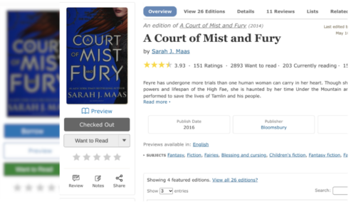
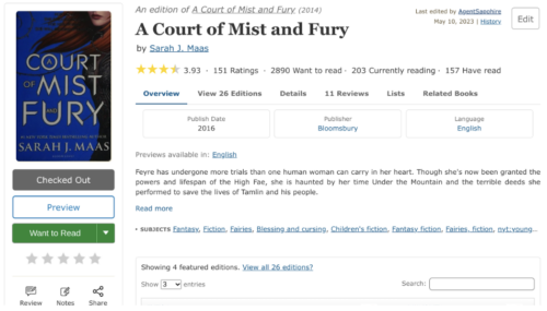
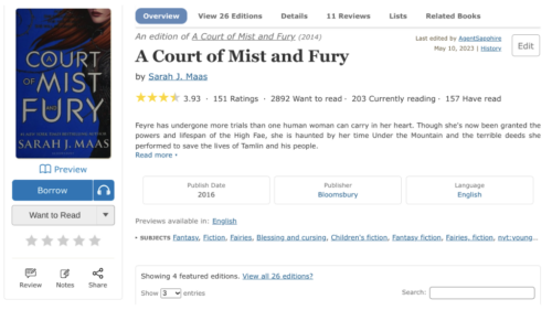
  1. Navigation Menu. The Books Page navigation menu has been designed to be more visually clear and relocated to the top of the page, directly beneath the main menu for better discovery. As you scroll, the fixed sub navigation menu dynamically highlights the corresponding section option based on the scroll position within the website.
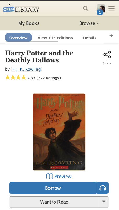
  2. Buttons. Because we had so many buttons competing for attention, the “Preview” button has been replaced with a more subtle link below the book cover. The prominent green “Want to Read” button has also been updated to a more neutral gray color. Finally, on mobile, the share button has been moved up from below the fold, next to the title.
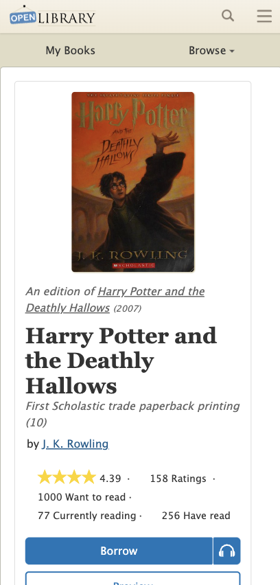
  3. Mobile. The Mobile Books Page now features the book title and author first, then a prominent book cover, and finally available read options, all above the fold.

Desktop

Before

After

Mobile

Before

After

Feedback Welcome

In pursuit of improving accessibility for all patrons, we empathize that website changes may also be challenging for our readers. We welcome and appreciate your feedback so we can further improve the usability of our services. Please feel free to share your thoughts or questions in the comments section and connect with us on Twitter.

A Brand New My Books Experience

Have you noticed our new My Books page experience?
Please let us know what you think!

Read on to learn more about what’s changed.

Forward by Mek

This year we’ve had the great fortune of collaborating with Samuel Grunebaum, 2022 Open Library Design & Engineering Fellow. Samuel is wonderfully positioned at the cross-section of software engineering, design, and education, making him capable of rapidly prototyping new designs, ensuring these designs are clear and instructional, and bringing these designs to life through engineering. It’s rare I find someone, like Sam, who can so easily and effectively switch contexts between design and engineering while also keeping bigger product pictures in mind. This set of skills has not only made Sam essential to early prototyping stages, we have also benefited greatly from Sam’s ability to uniquely recognize and raise challenges about component accessibility and mobile/desktop compatibility we likely would have otherwise missed. In addition to being a 2022 Open Library Fellow, Sam co-directs a software & design consultancy that is accepting new freelance projects, tutors college, high school, and intro-level computer science and is accepting new students, and is open to the right mission-aligned, full-time role.

Personal Intro

Hello, I’m Samuel Grunebaum and I’ve been working with Open Library as a Design & Engineering Fellow, contributing designs and code to the My Books redesign process. I’m currently transitioning into a career in software design and front end engineering after working as a Computer Science educator at the Horace Mann School in The Bronx, New York and as a freelance designer, developer, and teacher in all things software.

Problem

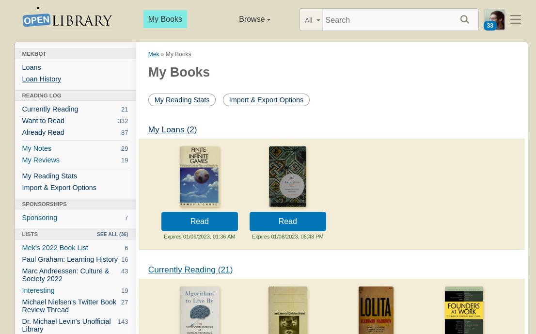
Open Library patrons and stakeholders alike identified the My Books page as a major pain point in the site’s navigation and information hierarchy. At the beginning of the project the desktop interface loaded by clicking the ‘My Books’ button in the header looked like this:

Perhaps the most confusing issue with this flow, is that the ‘My Books’ button brought patrons to their account’s Loans page. Another problem that was continually observed with the existing design is the mobile navigation on this page:

The mobile design took the desktop sidebar menu and added it directly below the site header, creating three layers of navigation and a very confusing split in the My Books page interface. 

The central problem of the existing design for My Books was that there was no true My Books page, but rather a My Books button driving to the Loans page. This meant that there was no single place for patrons to find their books, whether books they had on loan or books they had added to one of their reading logs. 

The previous menu design also had the unfortunate side effect of burying the Reading Log options, as well as Reading Stats, Notes, Reviews, and Import/Export options deep below the fold in an already confusing mobile menu. 

Digging deeper into this problem and hearing from Open Library stakeholders, patrons, librarians, and the community at large clarified the direction we would take: working towards a mobile-first consolidated My Books interface that gives patrons an understandable and discoverable way to access the books associated with their account, as well as the other account specific sections including Stats, Notes/Reviews, and Lists.

Interim Fix

Before beginning the design process in earnest, we decided an interim fix would be helpful to mitigate the confusing nature of the mobile My Books navigation. The solution we decided on was an extremely quick fix, able to be implemented in just a few minutes. 

The adjustments made used a darker color to differentiate the menu from the rest of the header and the page content, as well as making the menu section smaller with an adjustable height click-and-drag feature:

Approach

After meeting with members of the Open Library team to discuss the main issues, we agreed that the central areas to focus on were:

  1. Creating an interface unique to My Books that would consolidate a patron’s loans and logs into one page accessed by the My Books button
  2. Improving the usability of the My Books page on mobile by moving towards a responsive, mobile-first design for the My Books page and redesigning the menu on mobile

The next step was to iterate multiple potential interfaces for the new My Books page on both mobile and desktop. With the help of the Open Library team and other design fellows, we came up with the following options for mobile and desktop My Books interfaces:

In conjunction with Dana, another 2022 Design Fellow, we continued to iterate on the designs based on feedback received from Open Library stakeholders, librarians, and patrons. 

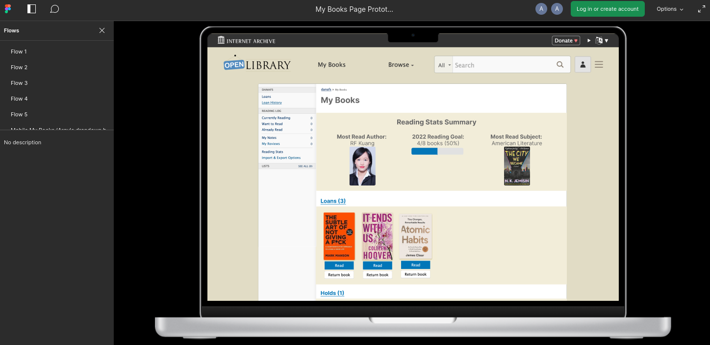
We settled on the following approach for desktop, which includes new carousel sections for displaying books and creates space for a Reading Stats data visualization widget:

Alongside the new desktop design, the mobile-first redesign that we settled on makes use of the existing sidebar menu to guide the structure of the new mobile interface while making use of an information hierarchy already familiar to patrons. 

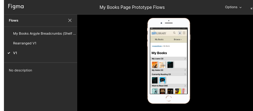
This mobile design not only improves usability and accessibility to the key components of My Books, but also decreases engineering overhead by allowing for a responsive design using the original sidebar menu:

You can try the new mobile design prototype here.

First Phase Release: Desktop My Books Interface

The first and most immediate step to improving the overall My Books experience was to create a distinct page on the site for an account’s books. The new My Books page now exists at /account/books for any patron of Open Library. The new page is almost a carbon copy of the original My Books page, but with its own content that is separate from the Loans page, which was originally what came up when clicking My Books in the header. Below is an image of the current desktop release of My Books:

After adding the new page at /account/books, I created a new file for the My Books content and added custom carousels to the page for displaying a patron’s loans and reading logs. Beyond improving the flow of clicking the My Books button, this initial redesign aims to increase user engagement with reading logs and will also populate the My Books page with images of book covers from a patron’s own selections, creating a more welcoming and dynamic account page driving from the My Books header button.

Another change in this release is the addition of Reading Stats and Import/Export Options buttons at the top of the page, as these are currently buried at the bottom of the My Books sidebar. In the next phase of the design, there will be a prominent link to Stats at the top of the My Books page with the addition of the data visualization widget.

The creation of this page not only provides an elegant interim solution to the issue of confusing My Books navigation by adding a novel page to the Open Library but also lays the groundwork for a more comprehensive redesign including mobile-first improvements, multiple new custom components, and more prominently featured a patron’s Reading Stats. 

Next Steps: Mobile Release and Stats

The next steps of the My Books redesign process will begin with improving the mobile usability by overhauling the My Books interface. The engineering approach I will take is to hide the My Books index content on mobile, instead only displaying the sidebar menu as the whole My Books interface. The sidebar will be responsively designed to display custom carousels on mobile, as rendered in this interactive Figma prototype.

The next and final step after completing the implementation of the mobile redesign will be to finish the redesigned desktop My Books interface by building the Reading Stats data visualization widget. Here’s an interactive Figma prototype of this new design.

I am so excited to continue working on this redesign process, which has already been a wonderful introduction to the Open Library design system and code base. Moreover, I’m excited to contribute to what is hopefully a welcome improvement to the Open Library ecosystem, increasing both access and usability to some really wonderful account features. My hope is that patrons will be able to more easily save and read books on Open Library once they have one clearly defined place to look at all of their books, whether checked out or saved in reading logs, as well as their reading stats and account information.

Reflections

Working on this project with the Open Library community has been an amazing experience in UX design, full stack web development, and community collaboration across state and national lines. I am grateful to be able to contribute to a project that is so meaningful to so many people through its unique ability to disseminate knowledge freely to anyone with Internet access. It was also a fun way to expand my web design and development experience. 

I am immensely grateful to the Open Library community as a whole for being so welcoming to me when I joined a few months ago and for continuously supporting my design process through helpful critiques and design input, as well as the general kindness shown in the weekly community meetings. I am especially grateful to Mek, my counter-point on Open Library staff, who has taught me so much about the Internet Archive stack and the Open Library design language, and my main collaborator Dana, who has expertly taken the reins on the Desktop interface designs and navigation for the overall site. I also want to extend my thanks to Drini, Lisa, Jim, Abby, and Hayoon who have all had invaluable contributions to the My Books design and implementation process, as well as the ongoing development of a comprehensive Open Library design system. I’m so excited to continue working with this community and for the completion of the My Books redesign. 

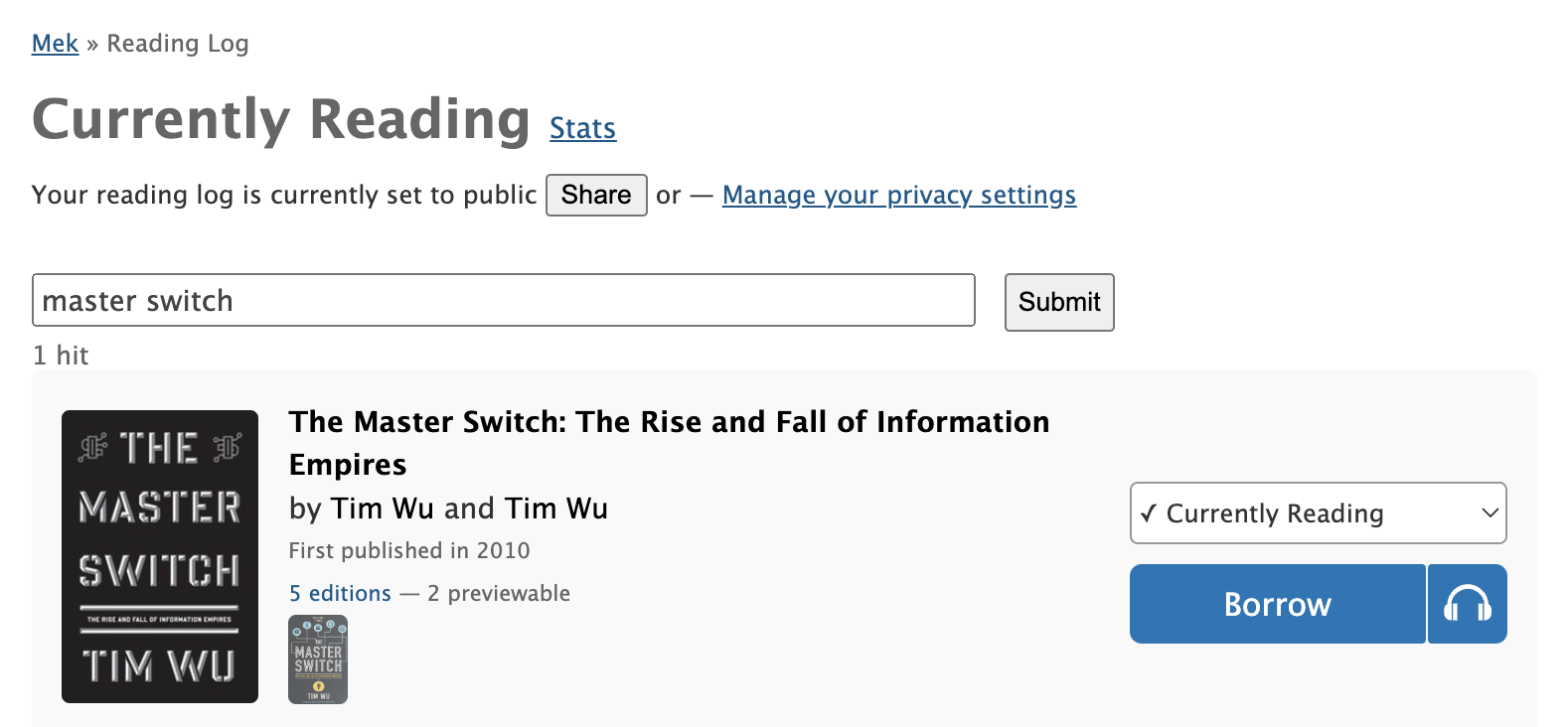
Search for Books in your Reading Log

by Scott Barnes, 2022 Open Library Fellow

As of last week’s deploy, it’s now possible to search the Open Library for the books in your reading log by navigating to the My Books page, selecting the Currently Reading, Want to Read, or Already Read bookshelf, and typing in a search query.

Keep reading to learn tips and tricks on how to effectively search for books within your reading log.

A Forward by Mek

This year the Open Library has been exceedingly lucky to collaborate with Scott Barnes, a lawyer who has reinvented himself as a very capable software engineer. We had the pleasure of meeting Scott earlier this year while he was scouring the Open Library for old rock climbing guidebooks. Ever since joining one of our community calls, he’s been surmounting challenging technical hurdles as one of our most active 2022 Open Library Fellows. As law professor Lawrence Lessig famously penned in his 1999 book Code: “Code is law”. I guess that’s why we shouldn’t be too surprised how quickly Scott became familiar with the Open Library codebase, at the precision of his work and attention to detail, and his persistence in getting code just right without getting slowed down. We hope you’ll enjoy Scott’s contributions as much as we do and learn at least one new way of using the reading log search to improve your book finding experience.

A Forward by Drini
I’m exceedingly pleased to introduce Scott Barnes to the Open Library Blog. I have had the honour of mentoring Scott throughout some of the projects on his fellowship, and have been floored by his love, passion, and skill in all things programming. Whether it’s working on user facing features (such as this one), improving code architecture, investigating performance issues, setting up infrastructure, or keeping up-to-date with new programming techniques by diving into a new programming book or topic, Scott is always excited to dive in, learn, and make an impact. And his code never fails to meet requirements while being well-architected and robust. I am so excited to see what he does next with his programming super powers! Because as far as I can tell, there’s no stopping him. Now without further ado, I’ll hand it off to Scott to talk about:

👋 Hi, my name is Scott Barnes. This year as a 2022 Open Library Fellow I collaborated with Drini Cami to develop reading log search. In this post, I’ll show different ways of effectively using the new reading log search feature, as well as technical insight into how it was engineered behind the scenes.

Profile photo for scottreidbarnes

3 Ways of Searching your Reading Log using a Web Browser

The most common way to use search your reading log is by entering a natural, free-form search query, just like you might using your favorite search engine. From the Currently Reading, Want to Read, or Already Read page, you can search for your books on that reading log shelf by submitting text describing the book’s title, author name, ISBN, or publisher. An example could be “Lord of the Rings by J.R.R Tolkien”.

If you want greater control, you can also harness the power of Apache Solr, the underlying technology which powers the Open Library search engine.

Let’s say, for example, that you’d like to find books on your reading log by a specific author named “King” but using the Natural Language mode instead returns books with “King” in the title. Using keyword search, you could search for author: king to see only books by authors named “King” (while not seeing books with “King” in the title). On the other hand, if you only want to find titles matching “King” and not the author, you could instead search for the keyword title: king. Want to find your horror books? Try subject:Horror.

For a list of common keywords, you can see the Open Library Search How-To Guide, or peek at the code behind it: worksearch/code.py.

Reading log search, like the main Open Library search, supports boolean operators, specifically AND, OR, and NOT, along with wildcards such as * and ? to match multiple characters and a single character respectively. Therefore, to search for all books matching “climb”, “climber’s”, “climbs”, etc., that were published by Sierra Club Books that you want to read, you could visit Want to Read and search for title: climb* AND publisher: sierra club books.

NOTE: the boolean operators are CaSe sensitive, so AND will work as expected, but and will not. The actual search terms themselves are not CaSe sensitive, however, so “king” and “KiNg” will return the same results.

Searching your reading log via the API

For those looking to perform programmatic searches, it’s possible to search via a web API using the following RESTful pattern: https://openlibrary.org/people/{USERNAME}/books/{SHELF}.json?q={QUERY}.

For example, to search for all titles matching “king” on my Want to Read shelf I’d query: https://openlibrary.org/people/srb36/books/want-to-read.json?q=king.

Or if I wanted to search for all titles matching climb* on that same shelf, I’d search for https://openlibrary.org/people/srb36/books/want-to-read.json?q=title:(climb*)

Behind the scenes

Now for the technical details! Reading log search was added in pull request #7052. In exploring how reading log search might be accomplished, two key things leapt to our attention:

  1. Reading log records are stored in the database, and work and edition data (i.e. “books”) are stored in Solr; and
  2. To work with the split data, we were probably doing more queries than we needed to, both in the back end itself, and within the templates that make up the pages.

The goal then was to add the ability to search the reading log, ideally while reducing the number of queries, or at least not increasing the number.

Changing the back end

Most of the heavy lifting was done in core/bookshelves.py. The challenge here was addressing the reading log records being in one database, and the edition data being in Solr.

The solution was to query the reading log database once, and then use those results to query Solr to get all the information we’d need for the rest of the process. Then we could simply pass the data around in a Python dataclasses, and then ultimately pass the results through to the templates to render for display in patrons’ browsers.

For the super curious, this is found in get_filtered_reading_log_books()

Changing the templates

As mentioned, having the data in two places had led to some excess querying, which manifested itself in the templates where we re-queried Solr to get additional data to properly display books to patrons.

However, because we had gathered all of that information at the outset, we just had to change the templates to render the query results we passed to them, as they no longer had to perform any queries.

How you can help

Volunteers not only help make Open Library special, but they help make it even more awesome. Check out Volunteering @ Open Library.

Improvements to the Main Navigation

Dana, UX/Design Fellow on Open Library

Forward by Mek

Few aspects of a website have greater impact and receive less recognition than good navigation. If done well, a site’s main navigation is almost invisible: it’s there when patrons need it, out of the way when they don’t, and it zips patrons to the right place without making them overthink. Over the years, we’ve attempted improvements to our navigation but we haven’t had the design bandwidth to conduct user research and verify that our changes solved our patrons problem. It turns out, we still had several opportunities for improvement. That’s why this year we were incredible lucky to have collaborated with Open Library UX Design Fellow Dana Fein-Schaffer, who recently transitioned into design from a previous role as a neuropsychological researcher. Dana’s formal education and experience links a trifecta of complimentary fields — computer science, psychology, and design — and has resulted in unique perspective as we’ve endeavored to redesign several of Open Library’s core experiences: the website’s main navigation and the desktop version of our My Books page.

As an Open Library UX Design Fellow, Dana has been in charge of design direction, conducting user interviews, figma mockups, feedback sessions, and communicating decisions to stakeholders. In addition to her skill prototyping and notable problem solving capabilities, Dana’s warmth with the community, affinity for collaboration, and enthusiasm for the project has made teaming up with her a gift. While we’d rather the fellowship not end, we endorse her work with great enthusiasm and highly recommend organizations which share our values to view Dana’s portfolio and engage her for future design opportunities.

The Design Process

IMG_7214.JPG

Hello, I’m Dana Fein-Schaffer, and I’ve been working as a UX Design Fellow with Open Library over the past several months. I’m currently transitioning into UX Design because after gaining professional experience in both psychology research and software engineering, I’ve realized that UX is the perfect blend of my skills and interests. I’ve been enjoying growing my UX skillset, and working with Open Library has been a perfect opportunity for me to gain some formal experience because I love reading and was hoping to work on a book-related project. Moving forward, I’m particularly excited about working as a UX designer for an organization that focuses on social good, especially in the literary, education, or healthcare spaces! If you have a role that may be a good fit, or if you work in one of those industries and are interested in connecting, please feel free to reach out. You can also learn about me from my portfolio.

Problem

At the beginning of my project, the current navigation bar and hamburger menu looked like this: 

I met with members of the Open Library team to identify three key areas of concern: 

  1. The label “more” was not descriptive, and it was unclear to patrons what this meant
  2. The hamburger menu was not consistent with the navigation bar items
  3. The hamburger menu was confusing for patrons, especially new patrons, to navigate

Approach

Before I began my project, the Open Library team decided to implement an interim solution to the first point above. To address the concern with the “more” label, the navigation menu was changed to instead include “My Books” and “Browse.” The website analytics showed that patrons frequent their Loans page most, so for now, the “My Books” page brings patrons to the Loans page. 

To begin redesigning the main site navigation, I first created a prototype in Figma with some potential solutions that built off of this updated navigation menu:

  1. I created a dropdown menu for “My Books” that would allow patrons to select the specific page they would like to go to, rather than automatically going to the Loans page
  1. I reorganized the hamburger menu to be consistent with the navigation menu and to use the subheadings of “Contribute” and “Resources” instead of “More.” I felt that these changes would make the hamburger menu easier to navigate for both new and long-time patrons. 

After creating the prototype, my next goal was to get feedback from patrons, so I scheduled user interviews with volunteers.

User Interviews

I conducted user interviews via Zoom with four patrons to answer the following questions: 

  1. How do users feel about the My Books dropdown? 
  2. Are users using My Books and Browse from the navigation menu or hamburger menu?
  3. Are users able to effectively use the hamburger? Do they find it easier or harder to find what they’re looking for using the reorganized hamburger?

Results & Findings

  1. Three out of the four patrons preferred the dropdown, and the fourth user didn’t have a preference between the versions. The patrons enjoyed having the control to navigate to a specific section of My Books. 
  2. All users used the navigation menu at the top of the page to navigate, rather than the hamburger menu, which supported the switch to “My Books” instead of “More.” This finding also highlighted the need to make sure patrons could access the pages they wanted to access from the top navigation menu. 
  3. Finally, all four patrons found the existing hamburger menu confusing and preferred the reorganized hamburger. Some patrons specifically mentioned that the reorganized hamburger was more compact and that they felt that the headings “contribute” and “resources” were more clear than “more.”

Synthesis and a New Direction

After learning from the user interviews that patrons preferred increased granularity for accessing My Books and a more concise hamburger menu, the Open Library team began discussing the exact implementation. We wanted to keep the navigation and hamburger menus consistent; however, we also wanted to provide many options in the My Books dropdown, which made the hamburger menu less concise. 

At the same time that we were debating the pros and cons of various solutions, another Open Library UX Design fellow, Samuel G, was working on designing a My Books landing page for the mobile site. Inspired by his designs, I created mockups for a desktop version of the My Books page. Having a My Books page that summarizes patrons’ loans, holds, and reading log at a glance allows patrons to still have increased control over My Books navigation while keeping the hamburger menu concise, since all of the individual My Books items can now be condensed into one link. 

Furthermore, having a My Books landing page opens the door for more ways for patrons to interact with their reading through Open Library. For instance, I’ve created a mockup that includes a summary of a patron’s reading stats and yearly reading goal at the top of the page. 

As we work towards implementing this design, I’m looking forward to getting feedback from patrons and brainstorming even more ways to maximize the use of this page. 

Reflections

Working with the Open Library team has been an amazing experience. I’m so grateful that I got to lead a UX project from start to end, beginning with user research and ending with final designs that are ready to be implemented. Working with such a supportive team has allowed me to learn more about the iterative design process, get comfortable with sharing and critiquing my designs, and gain more experience with design tools, such as Figma. It was also a great learning experience that sometimes your projects will take an unexpected turn, but those turns help you eventually come to the best possible design solution. Thank you to everyone who provided feedback and helped me along the way, especially Mek, who was a wonderful mentor, and Sam, who was a great collaborator on our My Books mobile and desktop project!

About the Open Library Fellowship Program

The Internet Archive’s Open Library Fellowship is a flexible, self-designed independent study which pairs volunteers with mentors to lead development of a high impact feature for OpenLibrary.org. Most fellowship programs last one to two months and are flexible, according to the preferences of contributors and availability of mentors. We typically choose fellows based on their exemplary and active participation, conduct, and performance within the Open Library community. The Open Library staff typically only accepts 1 or 2 fellows at a time to ensure participants receive plenty of support and mentor time. Occasionally, funding for fellowships is made possible through Google Summer of Code or Internet Archive Summer of Code & Design. If you’re interested in contributing as an Open Library Fellow and receiving mentorship, you can apply using this form or email openlibrary@archive.org for more information.