by Mek Karpeles, Tabish Shaikh
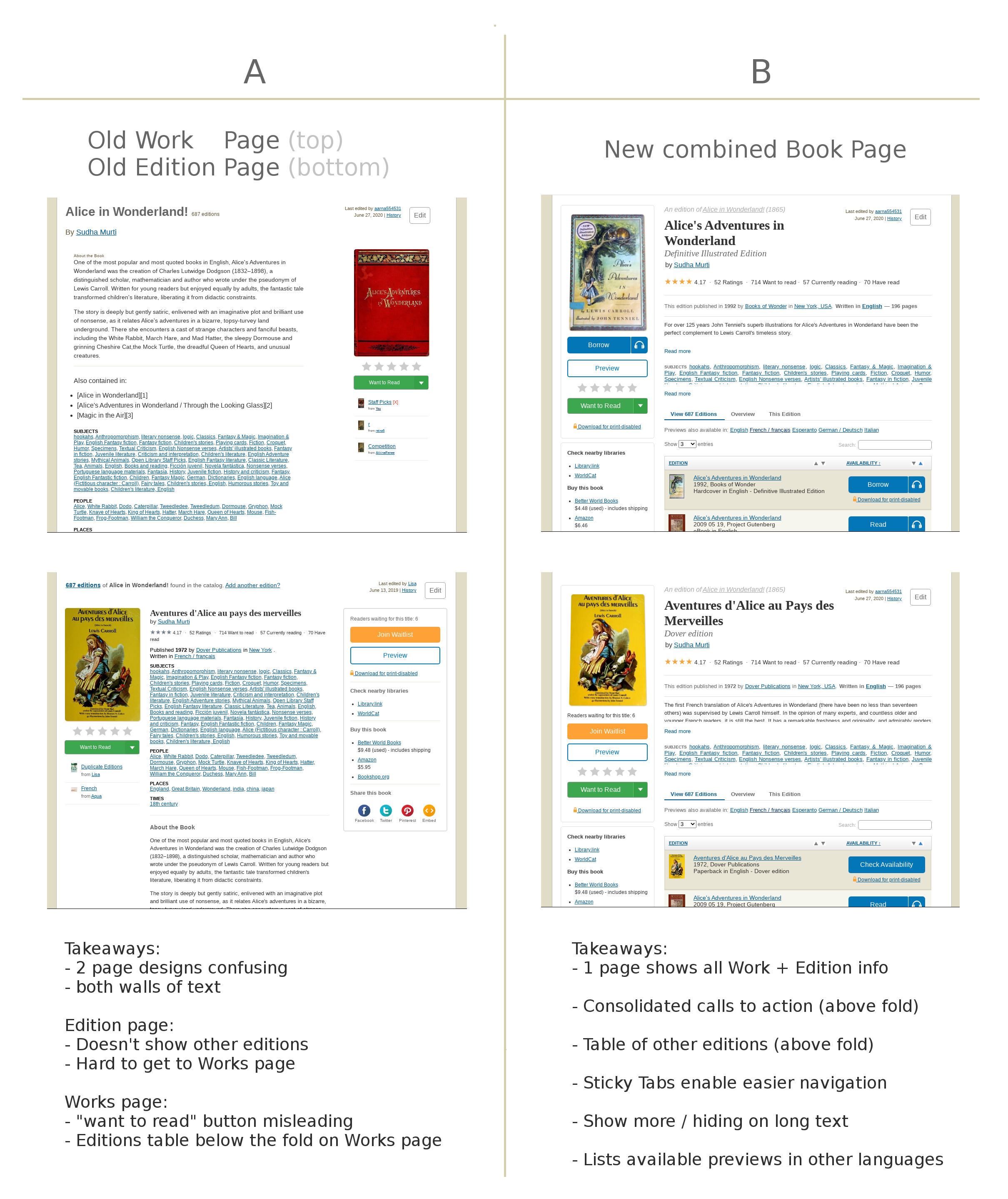
We’ve redesigned our Book Pages: Before →After.
Please share your feedback with us.
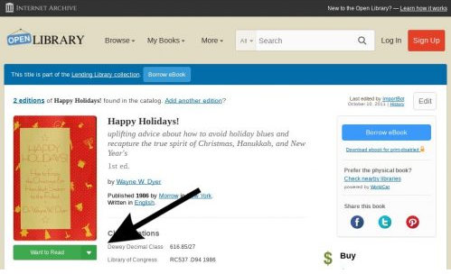
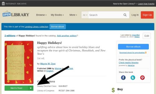
A web page for every book… This is the mission of Open Library: a free, inclusive, online digital library catalog which helps readers find information about any book ever published.
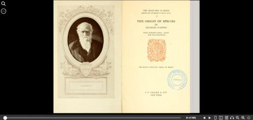
Millions of books in Open Library’s catalog have been made available to preview, read, or borrow using the Internet Archive’s controlled digital lending library. However, the catalog also features tens of millions of books which are yet to have previews and instead serve as resources that help patrons learn more about books, share lists of books they love, keep track of what they’re reading, and locate copies from bookstores and local libraries.
Continue reading